
You sit down at your desk fired up and ready to create a killer landing page. No doubt, this page is the thing that will make your email list sprout faster than flowers in May.
You stare at a blank canvas, willing the words flow through your keyboard.
But all you see is a blank screen.
You know a landing page can be a powerful marketing tool for your business or side hustle, but getting started from scratch can feel daunting.
Thankfully, having some tried-and-true landing page best practices to follow will help you overcome the blank screen to create a landing page that converts visitors to subscribers without hesitation.
Read on for 9 tips, tricks and landing page best practices to help you create a high-converting landing page.
1 - Write a benefit-focused headline
A headline is the first thing a visitor sees, so you need to make sure it grabs their attention from the get go. The value you offer needs to be immediately clear — after all, visitors need to know what’s in it for them if they’re going to sign up or buy from you.
In fact, a great headline could be the difference between your visitors reading on or exiting your page.
Approximately 80% of your visitors will read your headline, but only 20% will read the rest.
Our advice? Spend more time writing your headline than you do the rest of your page. Test different headlines to see which works best.
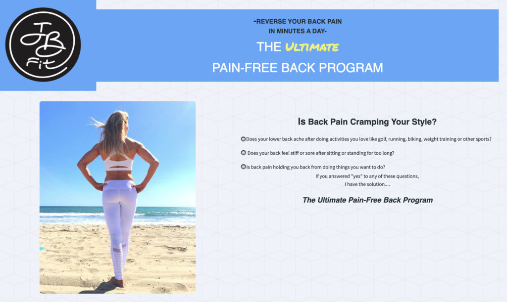
Check out the example below from JB Fit. See how she uses a benefit-driven headline to draw people in.
2 - Ask your visitor to do one thing
The old adage “Jack of all trades, master of none,” can apply to landing pages. Don’t ask too much of your visitors.
The ultimate goal of your landing page is to get people to take one desired action.
When creating your landing page, keep your one main goal in mind. If that’s to sell an ebook or product, sign up for an event, or capture an email address, then that’s your focus.
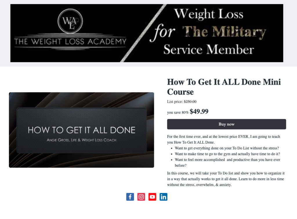
Check out this landing page from The Weight Loss Academy. The goal of the page is obvious: to sell a mini course for $49.99. There’s very minimal navigation, and the social media buttons at the bottom of the page are there to provide validation.
3 - Use images that match your messaging
They say a picture is worth 1,000 words. A picture can also evoke emotions easier than words on a page.
Include images that showcase your fantastic product. Or, use images to illustrate the feeling you want your audience to experience upon receiving your offer, newsletters, or attending your event.
If you can show the transformation a customer will experience with your product or service, they’ll be more likely to purchase.
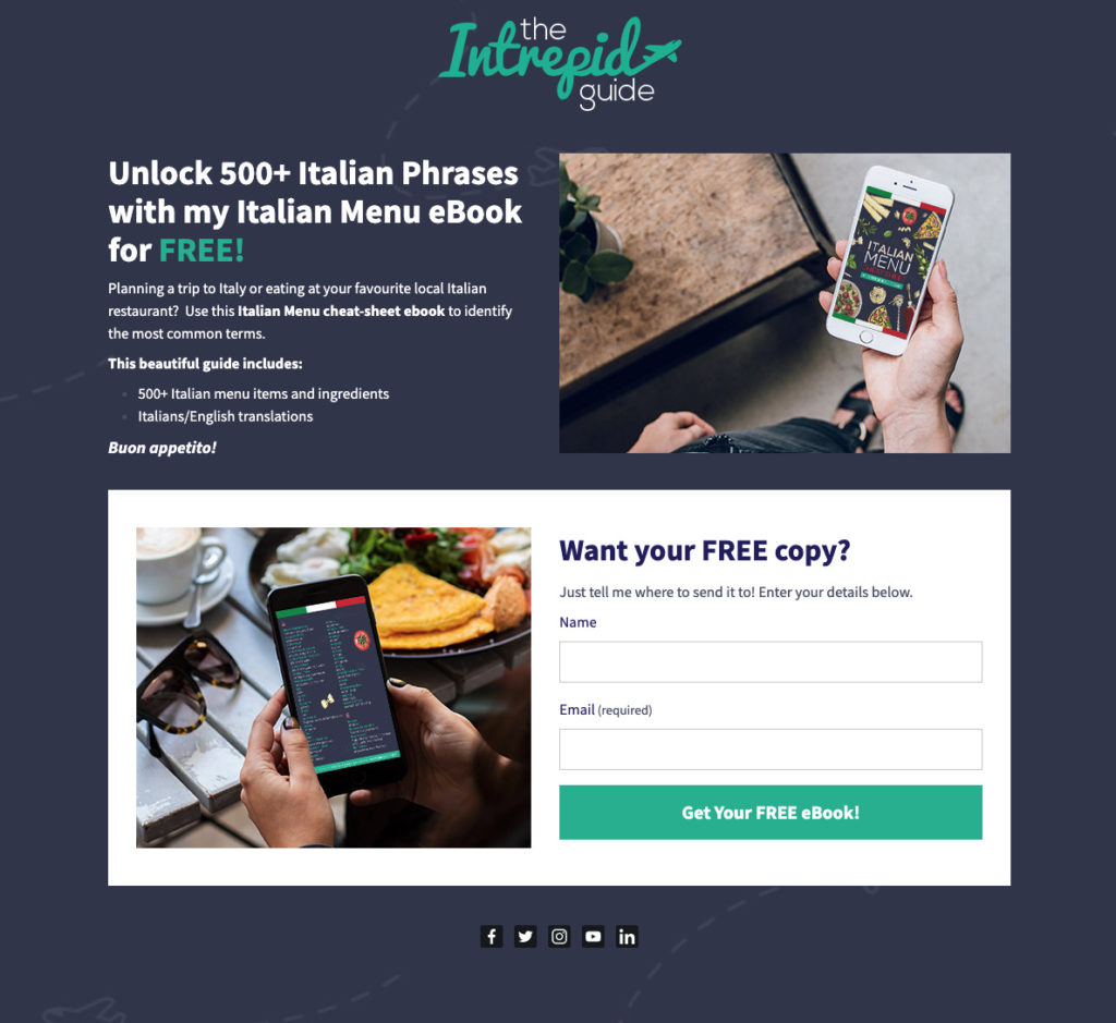
The Intrepid Guide does a great job showcasing how users will experience their Italian menu ebook through the images on their landing page.
4 - Create a strong call to action button that stands out
Your call to action (CTA) button is one of the most important elements of your landing page. The headline gets them in the door. The CTA closes the sale.
Your CTA button needs to stand out and clearly communicate the value of your offer.
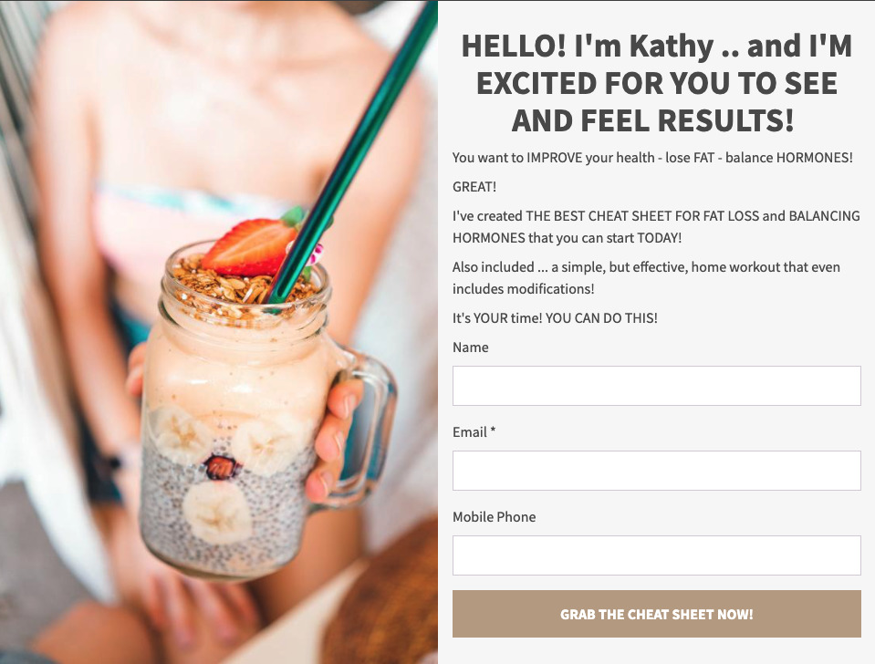
See the powerful call to action on this landing page. “Grab the cheat sheet now!” is a clever way to differentiate the call to action from standard language like “sign up” or “download”.
5 - Keep the most important information above the fold
2.7 seconds.
That’s all the time you have to grab a visitor's attention. With such limited time to convince someone to continue reading, you need to put your best foot forward. That’s why it’s crucial to include the most important parts of your landing page above the fold.
“Above the fold” is the portion of your landing page that can be seen without having to scroll. If the information you include above the fold isn’t captivating, readers won’t continue scrolling down your page.
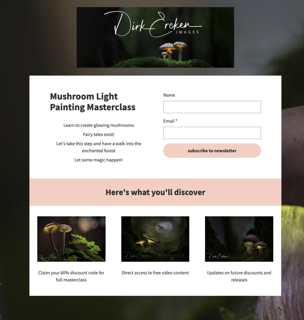
Dirk Ereken Images puts the most important information he wants readers to see strategically at the top of his page.
6 - Do not include top navigation
Unlike a website, which should allow visitors to check out different pages on your website, your landing page should not include a top navigation bar.
Why?
Because a landing page should have a singular focus. Simplify the path to conversion. Remove “distractions” so visitors’ focus is on the action you want them to take.
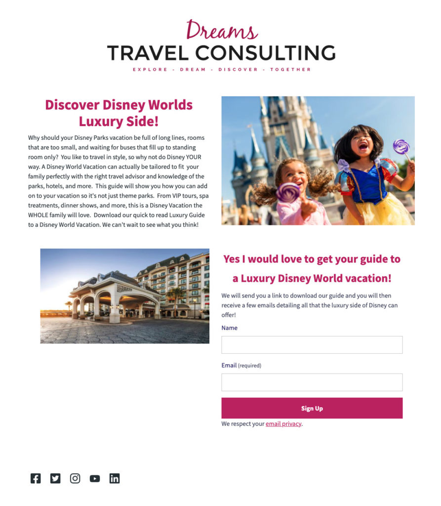
Check out how Dreams Travel Consulting limited the top navigation and focused instead on driving visitors to sign up for a guide.
7 - Optimize your page for every device
This is really best practice for any website or landing page you create: make sure your page is optimized for mobile, desktop and tablet.
We’ve all had this experience: you open a web page on your phone and you have to zoom in just to read some text. This is a bad user experience. People expect a page they can easily engage with.
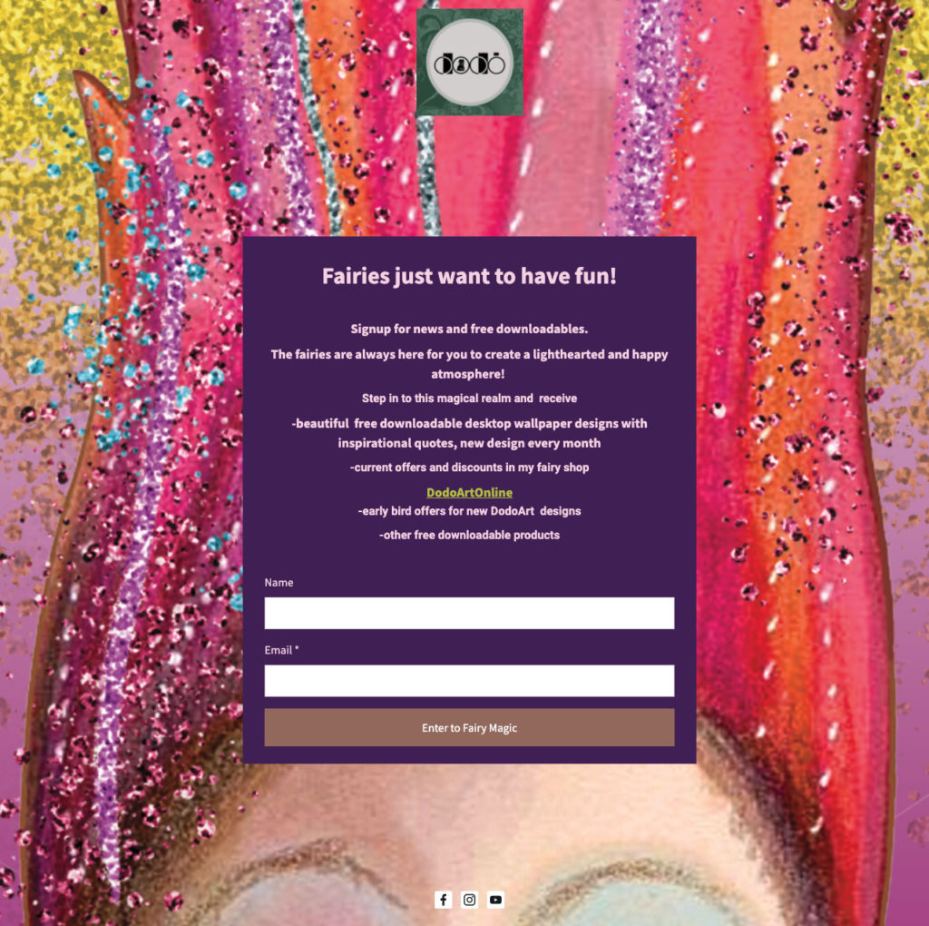
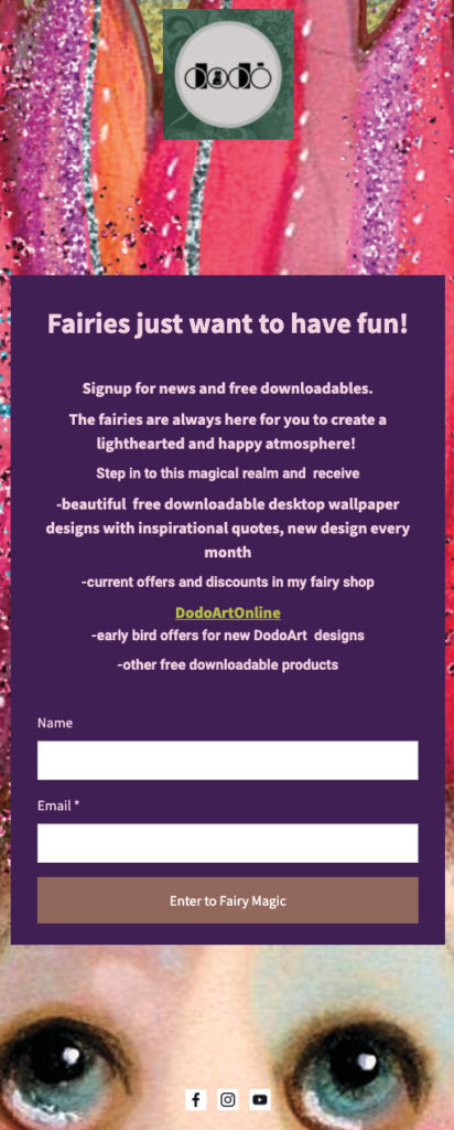
Check out how Dodo Art Online uses a mobile-responsive landing page to ensure visitors have a great experience on your site no matter the device they’re using.
8 - Direct the readers’ eyes
There have been some well documented studies to show how a visitor navigates through landing pages. Understanding the visual hierarchy can make creating a landing page that converts a lot easier.
Understanding how a visitor might view a landing page could help you get a higher conversion rate.
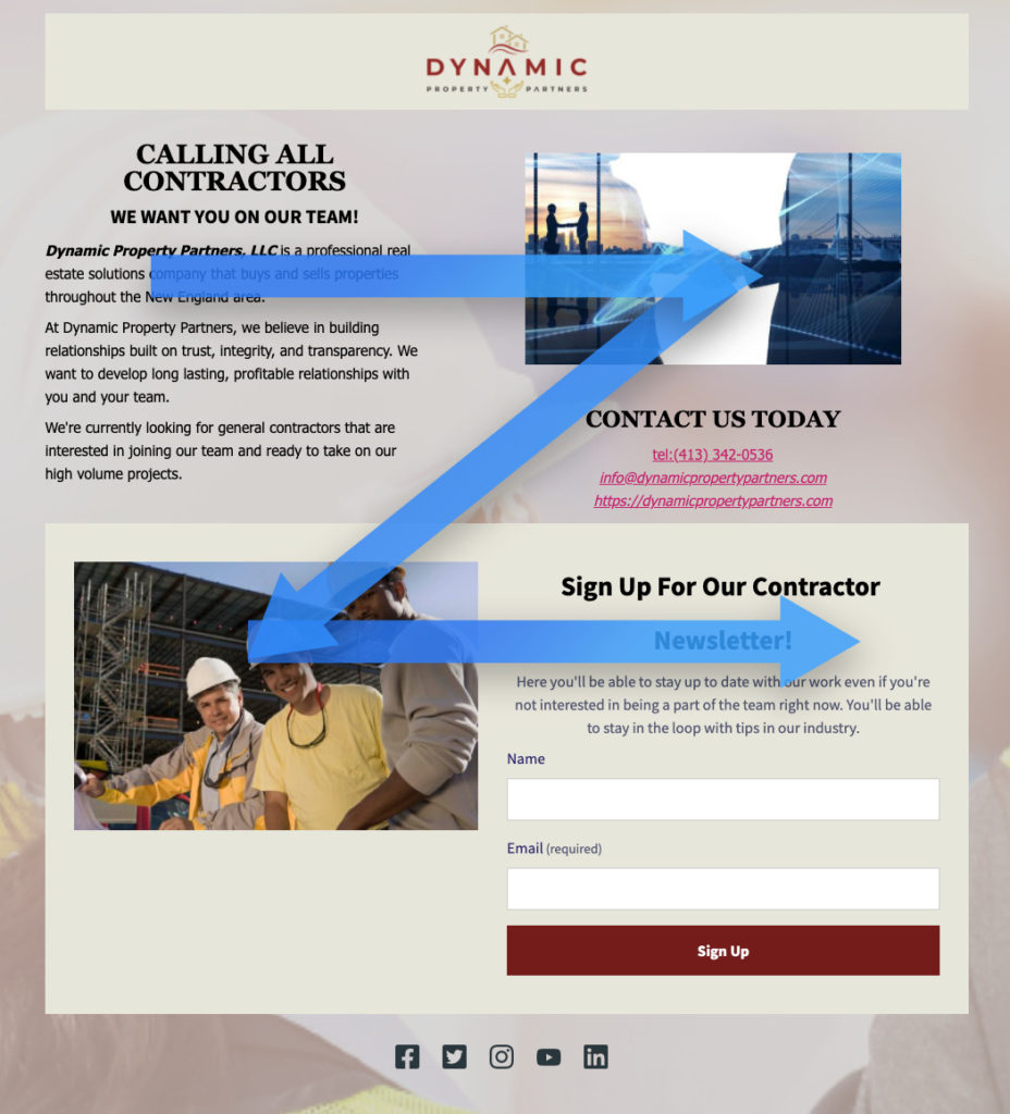
One visual pattern is known as the Z-pattern. On simpler landing pages, the eyes tend to start from the top left, move their way across the page, down to the bottom left then across again — forming a Z-pattern.
Here’s a great example from Dynamic Property Partners. They positioned the page with the Z-pattern in mind, so readers view the headline first. This page is designed to maximize their sign ups.
9 - Include social proof
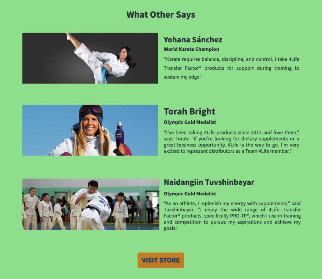
Build some trust and credibility with your visitors by showing how others have seen success with your product or service. Social proof — like testimonials or reviews — help visitors feel comfortable about their choice.
See what your customers are saying about you on social media and use that in your landing pages.
Put your knowledge of landing page best practices to work
Now take this important information and start optimizing your landing pages!
Need a starting point? Use a custom built template. All the landing page best practice examples shown above were designed using AWeber.
The post 9 Proven Landing Page Best Practices to Get More Conversions appeared first on AWeber.
from AWeber https://ift.tt/3vO7dH7
via IFTTT
No comments:
Post a Comment