This is the year of the email. Or, at least it should be: One research firm is predicting that 225.3 billion emails will be sent every day this year – which is a five percent increase from previous years.
And there’s a reason for this increase in sending: We love emails.
In fact, 72 percent of consumers say emails are their number one choice in brand communication. And businesses who use email marketing see huge financial returns.
While this could be great for the growth of your business, it could also become your biggest challenge.
With the increase in emails reaching the inbox, your email marketing strategy will need to rise above the competition to grab your subscribers’ attention.
To ensure your emails don’t blend in, here are five email marketing tips you can use to make your emails stand out above the rest.
Tip #1: Use Interactive emails to engage subscribers
When most people compare the appearance of a website to an email, they’d probably say the website is more visually interesting. With moving elements and clickable content, websites tend to be more visually interesting.
However, major Internet Service Providers (ISPs) like Gmail are supporting interactive emails.
Interactive emails contain an element(s) that subscribers can engage and interact with. Typically, this means an element changes as a result of clicking or typing something.
There are a couple reasons why interactive emails will play a bigger role in your strategy:
- More email companies are beginning to support the coding standards that allow for interactive elements in email.
- interactive emails, when used well, can increase email engagement and click-through rates.
In the email below, we built an interactive carousel that allowed subscribers to click through the three images in the email:
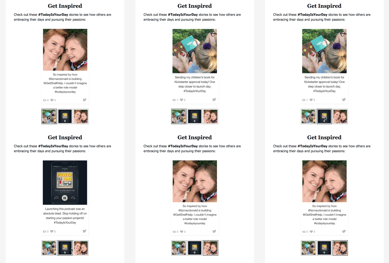
This carousel allowed us to place three images in one space, rather than stacking those images from top to bottom or relying on a GIF.
While a GIF would have acted similarly on a visual level by showing all three images in the same space, the carousel encouraged clicking and user engagement that a GIF would not.
However, while I love interactive emails, I would caution against building them just to create something cool.
Building an interactive element takes time and some knowledge of coding, and they are not supported by all email clients. So if you plan to use an interactive element, you should be confident that it will have a positive impact on your engagement and click-through rates before you spend time building it.
Take action: If you know how to code with CSS and HTML, use these instructions and create a similar carousel for one of your own emails.
Tip #2: Create emails that are easy to scan and read
As businesses send more and more emails to subscribers, you’ll end up facing more competition. And that only means one thing: it’ll be even more difficult to get your emails opened and clicked.
To cut through the clutter and immediately catch and maintain your reader’s attention, your emails will need to be easy to read and scannable.
A scannable email allows your busy subscribers to get the important information they need much faster. So instead of opening an email, seeing an overwhelming block of text and sending your email to the trash folder, they’ll read and click.
There are a few tactics you can use to make your emails more scannable:
- Try using descriptive and/or interesting headlines to quickly summarize your point.
- Catch your subscriber’s attention by writing short paragraphs and sentences.
- Use images and whitespace appropriately to separate chunks of text.
For the email below, Hotel Tonight uses three different sized headlines that vary from descriptive to interesting:
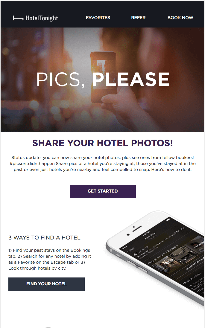
While the main header “Pics, Please” is intriguing and fun, the subheadlines below are descriptive. This combination grabs the attention of the reader and then quickly gives them context.
Additionally, by writing short sentences and separating paragraphs with images, they’re able to create an easy-to-read email.
Take action: In your next email, use descriptive or interesting headlines to break up sections of content, write short paragraphs and sentences. Make sure to include whitespace to break up large sections of text.
Tip # 3: Personalize your emails with dynamic content
Let's get personal with email marketing tip #3. Personalized emails that is.
Personalized emails get 29 percent more unique open rates and 41 percent higher click-through rates.
While segmentation is one of the best ways to customize your emails to your subscriber, there are other methods you can try.
One method I and other email fanatics love using is dynamic email content.
With a dynamic email, content is personalized to each subscriber based off data you have about that subscriber.
For example, in the email below, Grammarly created a dynamic email that shows a subscriber how they used the service:
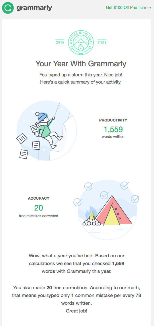
The numbers in the email are unique to each subscriber who received it. By using dynamic content like this, the subscriber can get a personalized snapshot of their account information.
Take action: You can easily create basic dynamic content in AWeber with custom fields. To do so, build a sign up form or landing page that asks your subscribers for personal information beyond their first and last name. Then, use custom fields in your email to pull in personalized information for each subscriber.
Tip #4: Place your call to action at the top of your email
Earlier I explained how scannable and easy-to-read emails will increase email engagement. But the placement of your call-to-action button may be just as impactful.
A few years ago, the team here at AWeber conducted a few email tests to figure out what makes up the perfect email. One test we ran was on call-to-action (CTA) button placement.
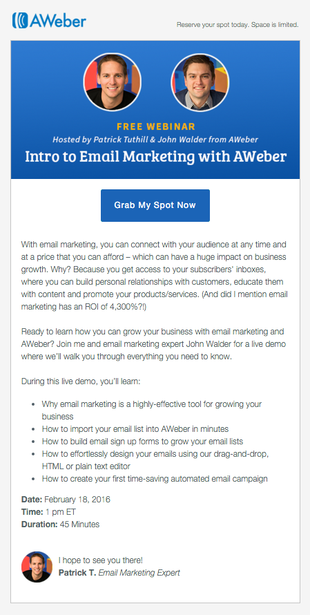
We created two identical emails with one slight difference: In one email the CTA button was positioned at the top and in the other, the button was at the bottom.
Version 1:
Version 2:
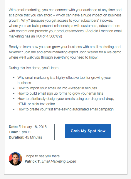
In the email where we placed the button at the top, we saw more than a 50 percent increase in clicks. We continued to test this top of the email button placement in other emails, and it consistently received more clicks.
Take action: You can easily apply this insight to your own emails to boost your click-through rates. All you have to do is move your CTA to the top of your email. You’ll just want to verify that your own email audience responds the same way ours did.
Tip #5: Automate your welcome email
Companies using automation see 53 percent higher conversion rates than those not using automation.
Although automated emails aren’t a new tactic, we’ve found that many businesses aren’t using them (despite how effective they are). In fact, in a recent survey we conducted of over 1,500 small businesses, we found that 65 percent of people do not use email automation at all.
So if you haven’t started using email automation, now is a great time to begin. And welcome emails are a great place to start.
When your subscriber signs up for your email list, they’re excited about the content they’ll receive from you. Your welcome email capitalizes on this excitement by giving them content right away.
A great welcome email can can prompt subscribers to engage more and unsubscribe less. And it may be one of the best performing emails in your automation arsenal.
For example, I created an automated welcome email for an email campaign that subscribers receive immediately after enrolling:
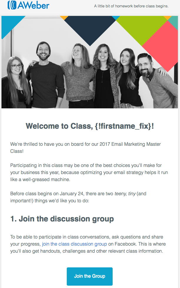
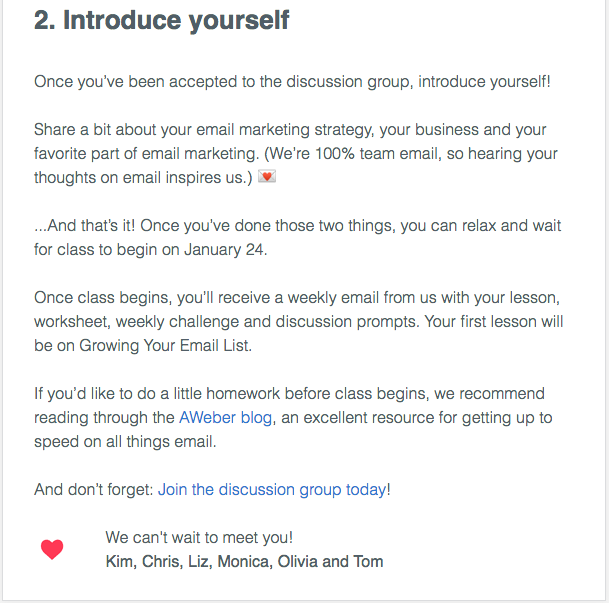
Because people received the email right away when they were excited about the class, we received an amazing 90 percent open rate and 45 percent click-through rate.
Take action: If you have an email list that doesn’t have an automated welcome email for subscribers, create one today. You may be amazed at the open and click-through rates you see!
Now it's your turn to kill it with email
These email marketing tips present some great opportunities to engage your subscribers with interesting, beautiful and well-written emails.
So how will you use these tips to improve your email marketing?
Go forth and email on, my friend. Your business will thank you.
This post was written by Liz Willts with contributions from Sean Tinney.
The post 5 Email Marketing Tips to Stand Out from the Crowd appeared first on AWeber.
from AWeber https://ift.tt/3wTigOU
via IFTTT
No comments:
Post a Comment