Despite the rise of social media and instant messaging, email newsletters are still one of the most effective digital marketing methods. Email newsletters help you build brand awareness, establish your brand as a credible source of information, and can provide product or event promotion opportunities.
There are 3.9 billion email users globally, more than the number of Facebook and Twitter users combined. Due to its low cost and extensive reach, email marketing ROI is one of the highest among marketing channels. The average return on investment is $36 for every $1 spent.
To enjoy the benefits of email marketing, you need to follow a newsletter structure that encourages readers to open your email, engage with your content, and click through to your site.
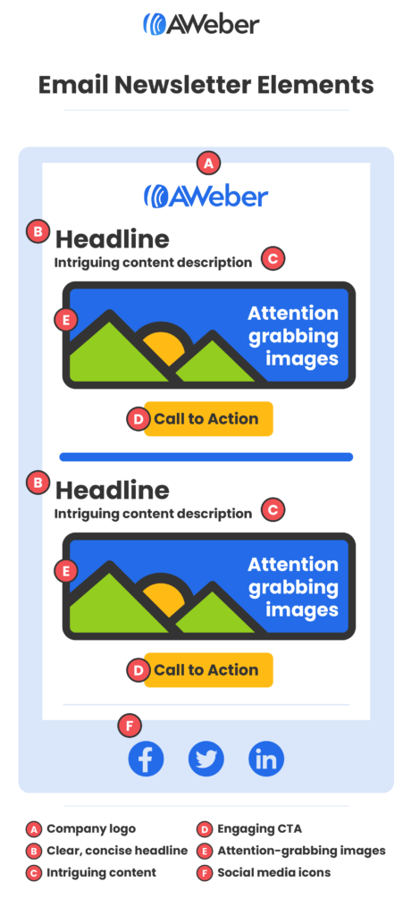
This article will teach you how to structure a newsletter by using six essential email newsletter elements. Read on to learn more.
Why does your newsletter need structure?
If you’ve ever received an email newsletter that consists entirely of a single block of text, you probably would have closed it right away. Let’s face it – email newsletters that look like they were written on the fly just aren’t very engaging. In fact, most of your subscribers won’t read your entire newsletter and will instead look for something that will catch their eye.
According to the Nielsen Norman Group, many readers consume content by scanning in a pattern resembling the letter “F”. They look for something striking first, then continue down the rest of the content if they see if it’s interesting enough.
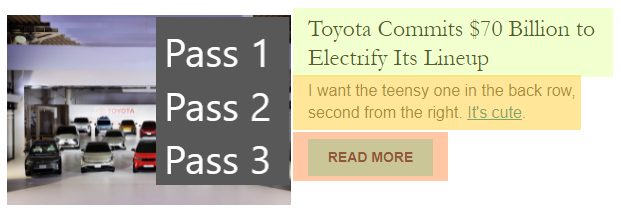
The newsletter above accommodates the reader’s tendency to scan content for something interesting. Now, compare the newsletter above to the one from Devex below:
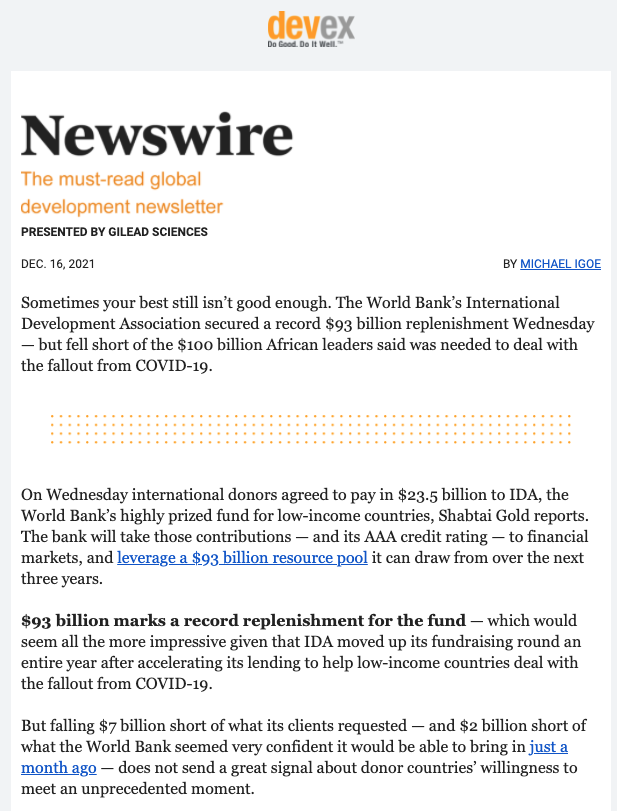
The newsletter in this example doesn’t read like a newsletter at all. It feels like reading a very detailed blog. This might be fine if you have enough time to read the whole thing, but not if you just want to know the gist of the content now and read more about it later.
Implementing a newsletter structure should account for the way your readers consume content. It increases email open and click-through rates and leads to more traffic to your website. It also makes your email newsletter look more professional and organized.
Six elements of a great email newsletter
A crucial part of structuring your email newsletter is deciding which elements you should include. While it’s tempting to cram a lot of content into one email, this doesn’t result in a very good reader experience, especially if you consider that up to 77% of your subscribers may read their emails on mobile devices.
For more effective emails, it’s best to use a newsletter structure that uses the six basic elements of a newsletter:
A clickable subject line
Your email's subject line is the first thing anyone reads. It's your one shot to capture the recipient's attention, and you don't want to leave that to chance.
So, what makes a good email subject line?
Well, it's a combination of being relevant, concise, and unique. While there is no one-size-fits-all solution, the main thing is to be mindful of your target audience. Make sure the subject lines are about them and not you.
While you can mention your brand name or products, you should be careful not to make it a habit. Steer clear of that “look at us” statement in the subject. Instead, use the same tone you’d use to talk to people in person, be conversational.
Here’s few good example:

The idea is to personalize your subject lines, make sure they are relevant, and connect with the overall email. Also, try to keep the tone of your subject line neutral so you don’t sound too spammy.
Once the email subject line catches the reader’s attention, the text that appears after it, also known as the email preheader, gives them a better idea of what’s inside and improves open rates dramatically. AWeber offers an easy way to add various preheaders to email newsletters, including personalized preheaders, FOMO, or CTAs.
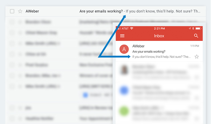
Fantastic email marketing content is useful only if your subscribers open your emails. Learning how to write better subject lines and preheaders will increase your click-through rates dramatically and improve your conversion rates too.
Attention-grabbing images
Many marketers underestimate the role of images and other types of visual content. Images support the primary thrust of your messaging and help the user understand your content better. In addition, images grab your readers’ attention and spur them into action. Look at the email newsletter from Tasty below:
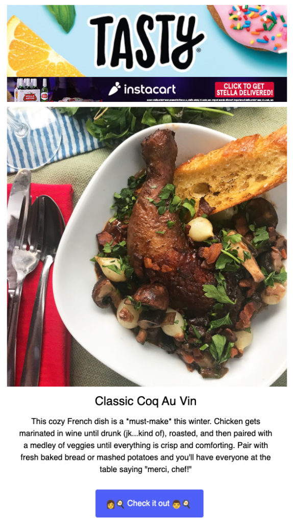
I can’t imagine an email about a recipe that doesn’t include an image of the dish itself, and your subscribers can’t, either. Even if your content doesn’t promote products that depend heavily on images to sell themselves, adding images to your email newsletter will get your subscribers curious, give them an idea of what they’re about to read, and convince them to click on the link.
Clear, concise headlines
The primary purpose of headlines in email newsletters is to provide structure to your content. They indicate where one piece of content starts and another ends. In addition, a clear headline is just as important as body text when it comes to sparking your subscribers’ curiosity.
Many email newsletters do away with body text and just send content headlines instead.
This approach is prevalent in mobile-friendly newsletters where space is at a premium:
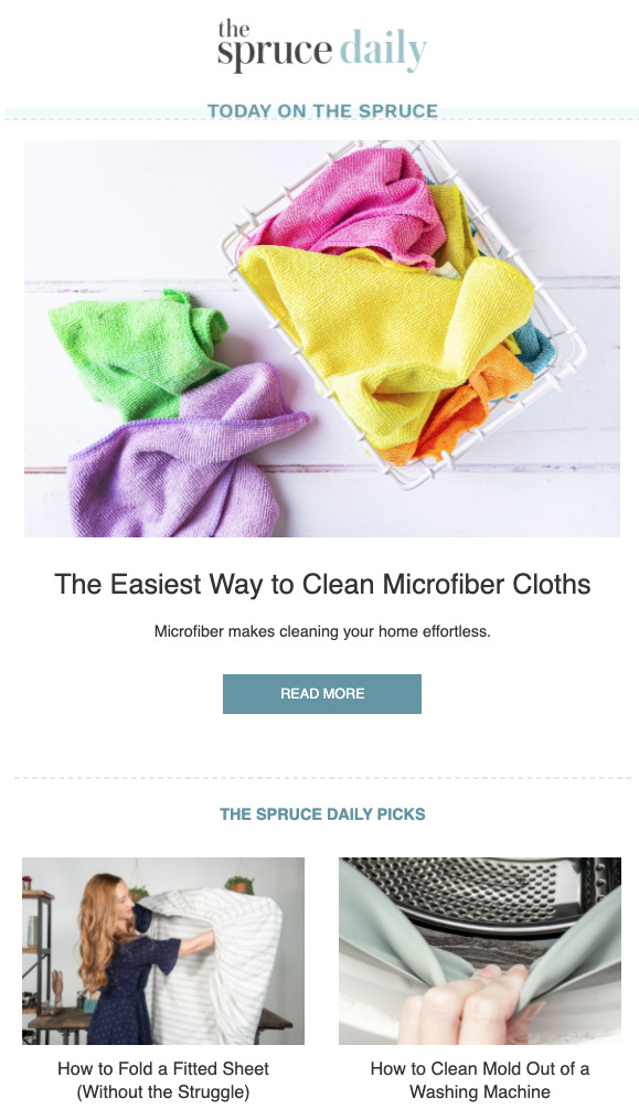
Aside from giving your readers an idea about your latest content, clear headlines help them easily find your content in their inboxes. For instance, if you’re looking for an email newsletter above because it has a link to an article about folding fitted sheets, searching for “how to fold a fitted sheet” will give you the result below:

By adding clear headlines to your email newsletters, you don’t just pique your subscribers’ curiosity. You’re giving them something to remember you by, making it easier for them to find your content among heaps of email newsletters.
Intriguing content descriptions
Most reputable email newsletters nowadays no longer send entire articles. Instead, they send headlines and links to content on your website. While a great headline is often enough to make the reader click through to your site, a matching content description reinforces the headline and convinces the reader to go ahead and click on the link.
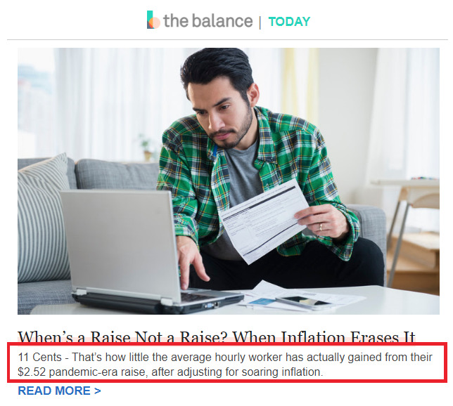
Depending on your target audience, the content descriptions in your email newsletters can range from just a few words to an entire paragraph. You can also summarize the article, tease the reader with a factoid that stands out, or provide some context to the article.
Engaging CTAs
A call to action (CTA) is a button with a short, actionable phrase. While CTAs usually appear at the end of marketing emails, a newsletter may have more than one, depending on the number of products or content pieces it promotes. With CTAs, you encourage the reader to take any action that moves the deal forward for conversions, whether it’s a subscription or an affiliate marketing transaction.
To make the most out of your CTAs, make it easier for the reader to locate them. You can use a button to make the call-to-action prominent and more accessible for the users to get there. The example from edX below uses brightly-colored CTA buttons against plain backgrounds:
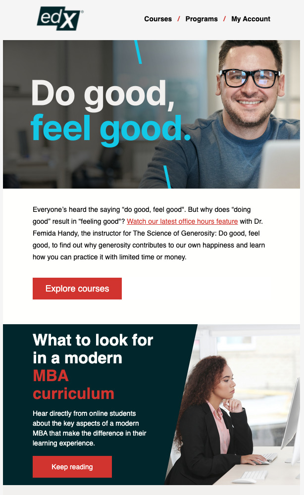
An effective CTA also contains compelling copy that tells users what they need to do. The CTAs use “Explore courses” and “Keep reading” in the example above. By keeping the copy short and straightforward, edX tells the user what to do while setting clear expectations: the reader can browse through online courses and read more about MBA curricula, respectively.
Social media links
While your email newsletter is a venue for sharing curated content with your subscribers, you probably update your social media more often. You need to reach your audience through the channels they typically use. Adding links to your social media accounts to your email newsletter footer will allow your subscribers to visit and follow your accounts:
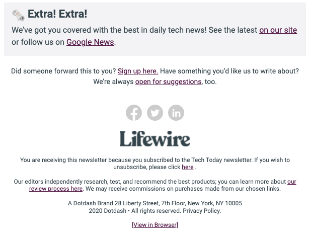
You might be wondering whether clicking on the buttons will affect email read time, which is a crucial email marketing metric you can use to gauge subscriber engagement. Fortunately, this action will open your brand’s social media account in a new browser tab, ensuring that the reader can quickly return to your email newsletter.
Wrapping up
Email newsletters have come a long way from the blocky, unfriendly news digests of the 1990s. Today’s newsletters seek to accommodate user behavior preferences, especially the shift to mobile devices. By adding structure to your email newsletter, you improve its readability, ensure that it’s accessible regardless of screen size, and increase click-throughs to your site.
We’ve discussed six common elements of high-converting email newsletters: subject lines, images, headlines, content descriptions, CTAs, and social media links. Together, these elements contribute to a positive user experience and ensure that your readers stay on your subscriber list.
So what are you waiting for, send your first email newsletter today. Need help getting started, don’t worry, AWeber has different email newsletter templates to help.
The post Six Essential Elements Every Email Newsletter Should Have appeared first on AWeber.
from AWeber https://ift.tt/Wiy3JZa
via IFTTT
No comments:
Post a Comment