
The true measure of a website isn’t how flashy it looks. When you’re trying to build an email list, success comes down to one thing: how well can you turn web visitors into subscribers?
New sign ups to your newsletter are called conversions. They’ll be your true goal here. And when it comes down to it, the most potent tool for converting viewers into email subscribers is your sign up page.
If someone finds you on social media, for example, they may eventually land on your sign up page. If someone finds one of your posts through Google or Bing, they should eventually find your sign up page.
Your sign up page is the point of decision where a new potential subscriber becomes a real subscriber. So make it count.
If you want a great signup page, you’ll have to stick to certain principles to ensure success. How do you turn your website from a traffic-gathering source to a bona fide email marketing machine? Let’s explore the key elements everyone should include.
What every sign up page needs
Also known as a landing page, your sign up page is as important to your email marketing as a landing strip is to an airport. It’s where the most critical steps happen. But what does a good sign up page look like in practice?
Here’s an example: fitness coach Alycia, a Zoomba instructor, was using a standard Facebook signup form to drive subscribers to her emails. But it wasn’t quite the draw she’d hoped it would be.
So Alycia sat down and created an honest-to-goodness landing page with AWeber’s sign up page builder. The result? A 100% increase in subscribers.
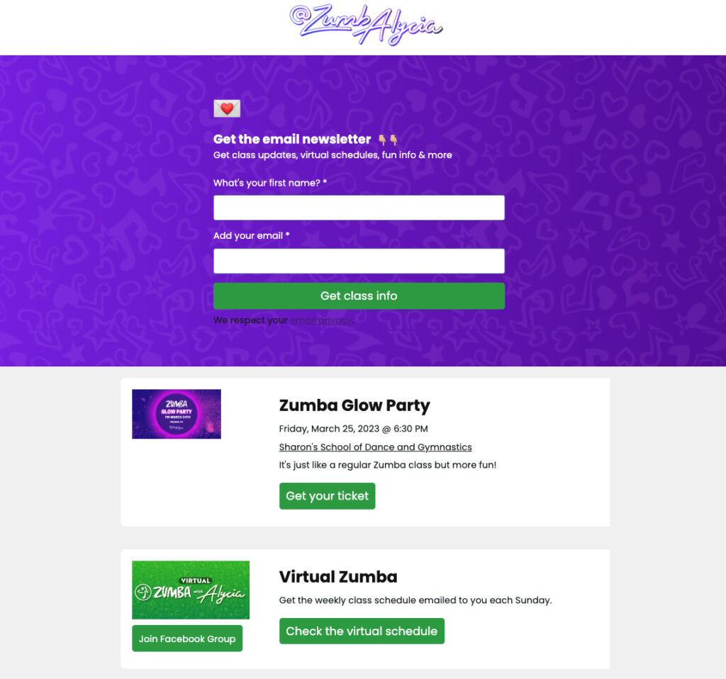
But setting up a new sign up page doesn’t quite tell the full story. You’ll still need to know how to nail the specifics of what every sign up page needs:
A Clear Header
This is the copy at the top of the sign up page. Your goal here should be clarity—ideally, you’ll demonstrate exactly what your visitor is signing up for.
For example, “The New York Photographer’s Travel Guide” is a crystal-clear header that addresses the benefits of signing up as well as the specific industry it relates to. Putting these in these terms helped James Maher increase subscriptions by 3x.
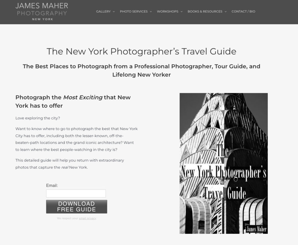
But notice something else that’s striking about that headline: the implicit promise of an incentive. That’s why you’ll also need to know about…
Compelling Incentives
They call some incentives “lead magnets” because they should exert some attracting force without you having to lift a finger. Think of a lead magnet as “a freebie you give your subscribers for joining your email list.”
With an incentive, any email newsletter is going to be instantly compelling, but it also needs to be highly relevant to your target audience. If it’s too far off-base from what your readers want and need, those subscribers will likely unsubscribe fairly quickly.
The premise is simple: give away something useful for free, and your most engaged readers won’t be able to help themselves—they’ll have to sign up.
It will help if you can elucidate the benefits of this incentive as well. In James Maher’s case, it wasn’t just the implicit promise of a “travel guide for photographers.” He also listed the specific benefits of reading it and outlined these benefits in bullet points.
Before you give something away, make sure you explain why it’s so valuable. More importantly, talk about the relevant takeaways your readers will get out of it.
Click-worthy Sign-up Buttons / CTAs
CTAs, or calls to action, are where the sign up form works its magic. Think of it as something like a “second headline.” The more clear you can make it—and the more incentivizing—the better.
For example, “Click here” is a notoriously bad CTA because it’s vague and doesn’t offer a specific benefit.
On the other hand, if your CTA says “Download your free guide today,” it offers a specific benefit that tells them exactly what they get through clicking.
Here's a great example from Contrarian Thinking:
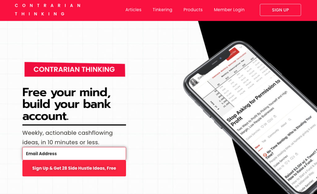
Later on, we’ll address more about what CTAs are and how you can optimize yours for more conversions.
How to write the copy for your sign up form
Remember a simple rule: Keep It Simple, or KIS.
No one wants to read dense, collegiate-style essays when they scan through a sign up form. They’re after simpler information: what are you offering, and what can they get out of it?
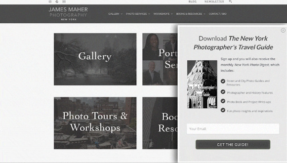
“Download ‘The New York Photographer’s Travel Guide” is a great example here. The headline is clear, offers a benefit, and doesn’t overcomplicate its offer.
You should also think about framing your email newsletter in terms of a “mission statement.” Think about the basic information that introduces you to readers:
- Who are you?
- Why did you start the newsletter?
- What’s your main goal with the newsletter?
- Who is the newsletter for?
Emma Johnson provides a great example of “mission statement”-style writing. Underneath her headline, she starts off with 1) her name, 2) her goals, and 3) what people will get from reading “Wealthy Single Mommy,” her newsletter.
A well-written mission statement means no one ever has to guess what your newsletter is about.
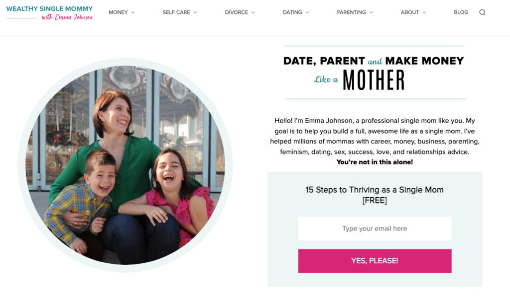
That kind of mission statement is especially useful if you’re building a personal brand. When someone wants to find out more about who you are and what you do, a simple trip to your sign up page will clue them in.
Finally, fill out all the appropriate fields of your sign up page without leaving placeholders. For example:
- The name of your newsletter. If you don’t have one yet, try to think in terms of what people will get out of signing up. For example, “Fitter in Fifteen Days” is a promise of a fitness tip per day for the next fifteen days. You can always come back and rename the newsletter.
- Fill in your body text. Think about what your readers need at this point. What are the benefits of signing up? Don’t just describe what your newsletter is. You’ll want a mixture of introducing the newsletter while simultaneously selling its key benefits to the reader.
- An appropriate CTA. Make sure your CTA is in line with everything that comes above it. But let’s get more specific about what makes CTAs compelling.
Write an engaging call to action (CTA)
We’ve covered a few CTA best practices before, but here are some key takeaways you can use today.
First, have fun with your CTAs. “Submit” or “sign up” don’t exactly get the click-finger itching to subscribe to a newsletter. “Start my fitness journey for free,” however, hints at an adventure.
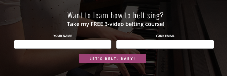
A great example of having fun with your CTA can be found at vocal coach Felicia Ricci’s sign up page.
“Sign up today”? That would be a tad on the bland side.
“Let’s belt, baby”? That’s a newsletter that sounds like it will be fun.
Next, try to hint that your newsletter makes things easy—and that the signup process itself will be convenient.
A CTA for a newsletter should sound like it can happen in a moment. For example, the word “Download” is a nice trigger for this, because we all know how easy it is to download a file these days.
Another trigger word for convenience is “Try.” There’s nothing overly intensive about trying something out. Who can argue with a CTA that sounds as breezy and effort-free as something you only have to try out once?
Build a sign up page that hits every note
Your sign up page, when done well, gives interested readers a compelling reason to share his or her email address with you so you can continue the conversation.
The design of your page should come first, which is why it helps to start with AWeber. Check out the landing page templates we have available at AWeber to see what your conversion machine can look like—and get started today.
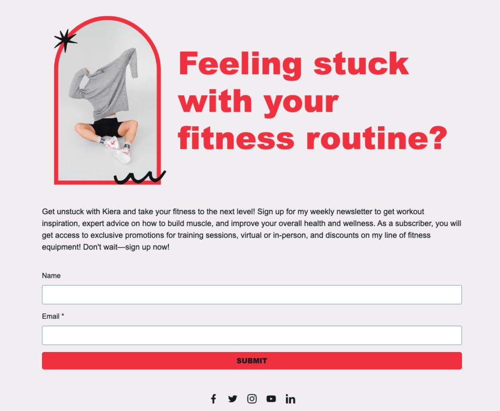
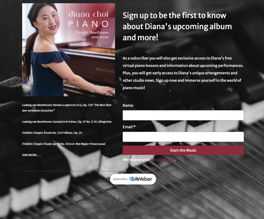
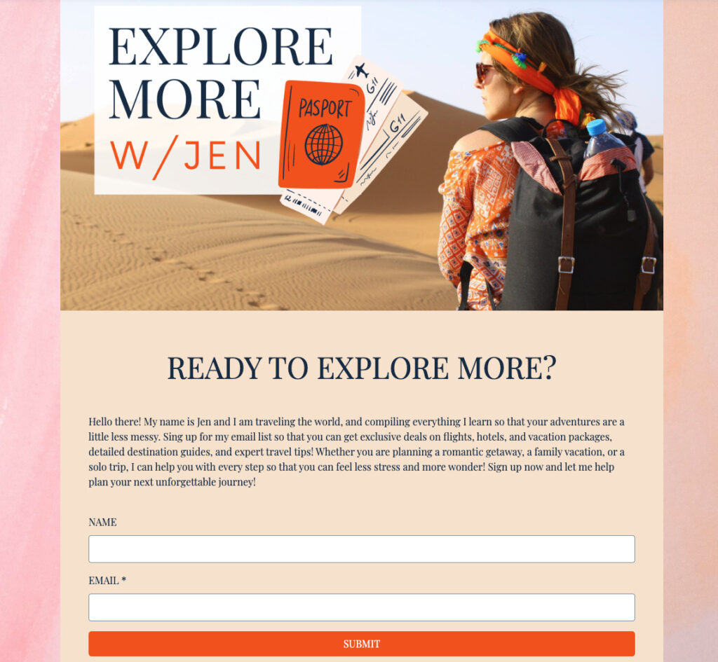
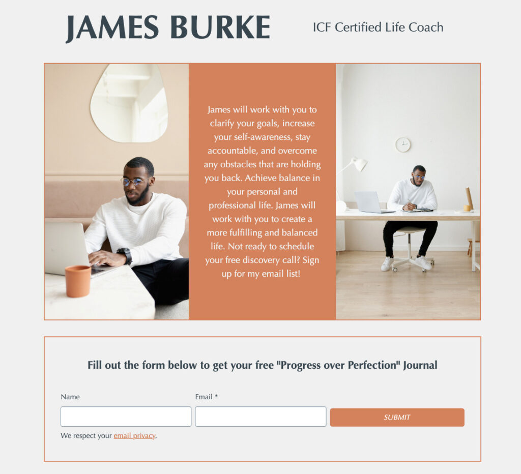
Here are just a few of our more popular sign up page templates that you can use for free in your AWeber account. Just click the image below and save to your account.
The post Sign up page strategies proven to increase your email audience appeared first on AWeber.
from AWeber https://ift.tt/m7rH9Sz
via IFTTT
No comments:
Post a Comment