Consistent branding makes a brand instantly identifiable — and memorable.
But did you know that as well as applying branding guidelines to your products, advertisements, and websites, it’s equally important to carry branding guidelines through into the email style guide for your brand. Let’s get started!
What is an email style guide and why is it important?
An email style guide is a set of guidelines that define the content and appearance of a company’s brand emails. Email guidelines outline specific standards for the messaging, tone of voice, and visual appearance of each email.
Creating a clear email style guide is important because it helps marketing teams generate content that consistently matches the brand’s identity. Achieving consistent branding across all channels (including email) is one of the best ways to improve brand recognition.
In turn, brand recognition will improve the success of email marketing campaigns by encouraging customers to engage with emails and take the desired action (e.g. clicking through to a landing page, offer, or resource).
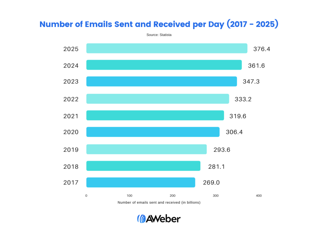
Billions of emails are sent each day. By creating easy-to-apply guidelines, templates, and image databases for your email copy, you’ll support your brand image and set up your email marketing campaigns for success from day one. Plus, it’s a great way to speed up email creation and save time.

Do I need an email style guide if I have other brand guidelines?
The short answer is yes. Even if you already have a set of brand guidelines for product design and online content, it’s important to follow this through to your email copy. Most organizations will already have a general style guide outlining things like:
- Tone of voice (with examples)
- Brand logo and any variants
- Imagery and video content
- Fonts and color schemes
- Brand editorial style (e.g. titles, abbreviations, symbols, quotes, citations, and numbers)
While these guidelines can be helpful when applied to email, it’s much better to create a separate style guide specifically for email content. This is because email is subject to additional criteria like device compatibility, image blocking, and rendering considerations.
Any email style guide you create should still be complementary, however — you don’t want your emails to feel different from everything else you do! It’s just much simpler to have one dedicated guide per channel so that your marketing and content creation teams know where to find everything.
How to write an email style guide: what to include
Ready to create an email style guide but not sure where to start? Every email style guide should contain the following basic elements:
Text guidelines
Provide detailed text guidelines for all the different text formats that might be used in your email copy. Common email text types include the following:
Envelope copy
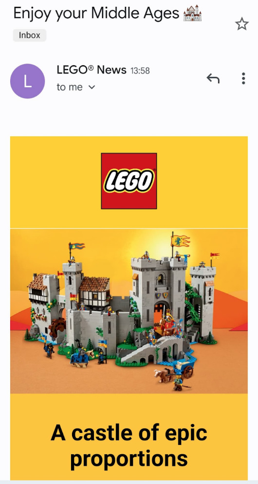
This is any copy like subject lines and preheader text that appears in the inbox before the subscriber opens the email.
In your style guide consider factors like whether this copy should be personalized, any keywords to include, and if/how you want emojis included in subject lines. Make sure to cover things to avoid, too — like all caps.
Etiquette and tone of voice
Outline the tone that should be used in your email copy to reflect your brand personality. Is your brand’s tone formal? Friendly? Do you make jokes, or keep things serious?
Remember that the tone you choose should reflect your target customer. For example, if you’re marketing a communications platform as a service software to corporate managers and VPs then you might want to keep the language professional and informative.
Text styling
This encompasses things like font choice, color, and even positioning within the email itself. Make sure you have a list of acceptable choices and check all fonts chosen work on multiple devices/operating systems.
Alt text
Provide instructions for writing alt text, including any accessibility factors. Your style guide should clear up questions like:
- When should/ shouldn’t images have alt text?
- Are there any style guidelines for alt text?
- Should alt text replicate graphical text in images?
- Is alt text required for icons?

Image guidelines
Provide detailed image guidelines for all the different visual formats that might be used in your email copy. Common email image considerations include the following:
- Image type: Do you use static images, GIFs, stock images, or data-based images?
- Image style: How is the image incorporated into the email? Are there any borders, drop shadows, or on-image text?
- Image size: This covers both file size and height/width of featured images, secondary images, thumbnails, GIFs, and other standard visual elements.
- Image resolution: The number of pixels per image and file saving requirements.
CTA language guidelines
Provide a range of examples of acceptable language for calls to action (CTAs). CTA formatting options to consider include:
- Hierarchy: Provide a list of potential primary and secondary CTAs and instructions for when and where to use them in email copy.
- Style: Provide a list of standard language for all CTAs or a list of pre-written CTA variations to choose from.
- Buttons: Provide all necessary code snippets for CTA buttons.

Remember, a CTA doesn’t have to be a call to purchase — you might also just want people to engage with some new content. For instance, if you’ve finished a blog post comparing two e-sign services, you might include ‘check out HelloSign vs PandaDoc to learn more about digital signing’ as your CTA.
Frequently used content
You’ll likely have design elements you use a lot — certain CTA buttons, product images, or your logo. Provide a list or database of frequently used content that copywriters can use as part of branded email copy. This helps keep copy consistent, recognizable, and will improve the efficiency with which email copy can be created and approved for publication.
Common standardized elements include:
- Icons
- Promotions
- Value propositions
- Taglines
- Disclaimers
- Headers and footers
- Guarantees
An email newsletter template
Finally, consider including a predefined email template. Even better, consider creating multiple templates for different email formats (e.g. newsletters, welcome emails, promotions, or even an affiliate marketing agreement template).
That way, rather than starting from scratch every time (and risking mistakes creeping in) your team can easily just add their content to something that already works — saving them time and leading to better, more consistent emails.
How to apply your email style guide
We’re almost there. Now that you’ve got all of the elements for your email style guide prepped, let’s discuss some final best practices for using and applying your email style guide.
Stick to the guidelines
Once you’ve published the guidelines, stick to the guidelines. Deviating heavily from email style guidelines will damage brand identity. Remember that the guidelines are there to help writers and designers create content that aligns with your brand identity. Add a step to your email development workflow where someone checks each new email against your in-house email style guide.
Create campaigns that align with brand image
When the time comes for your next big marketing campaign, head straight to your brand and email style guidelines. It’s so important that marketers keep brand image and tone in mind when formulating and structuring advertising and digital marketing campaigns.
Make sure your email template is mobile friendly
In order to maintain brand professionalism and credibility, your content must render well across platforms, particularly mobile. Make sure that your marketing emails and newsletters look good and function optimally on all digital devices.

It’s a good idea to keep this in mind when writing up your email style guide. Common stumbling blocks when it comes to email renderability include things like:
- Custom bullet points (standard bullets render better)
- Lack of alt tags on images
- Particular coding types (e.g Float and Clear)
- Certain types of tags (choose HTML over div tags)
- Javascript
- Text-to-image ratios
- CTA Placement
- CSS stylesheets
Align envelope copy and landing page messaging
Finally, make sure the style and substance of your email copy aligns with the copy on your landing page. Ensure that messaging is consistent between marketing materials and on-page content.
When customers click through from an email, they should find on your landing page the very thing communicated in the content of the email. For example, if you send out an email with a free trial of your new crowd-testing app, then make sure that the email clicks through to your trial page.
Emails should always guide readers to a relevant online page that builds on the content of the email itself, whether that’s a particular product, offer, or blog post.
Don’t neglect email!
So there we have it. Most of us are already familiar with the importance of consistent branding. If you haven’t got a designated email style guide already, now’s the time to start. Creating an email style guide will reinforce your branding, increase brand visibility, and support growth.
The post Why You Need an Email Style Guide to Reinforce Your Branding appeared first on AWeber.
from AWeber https://ift.tt/H6Si3jq
via IFTTT
No comments:
Post a Comment