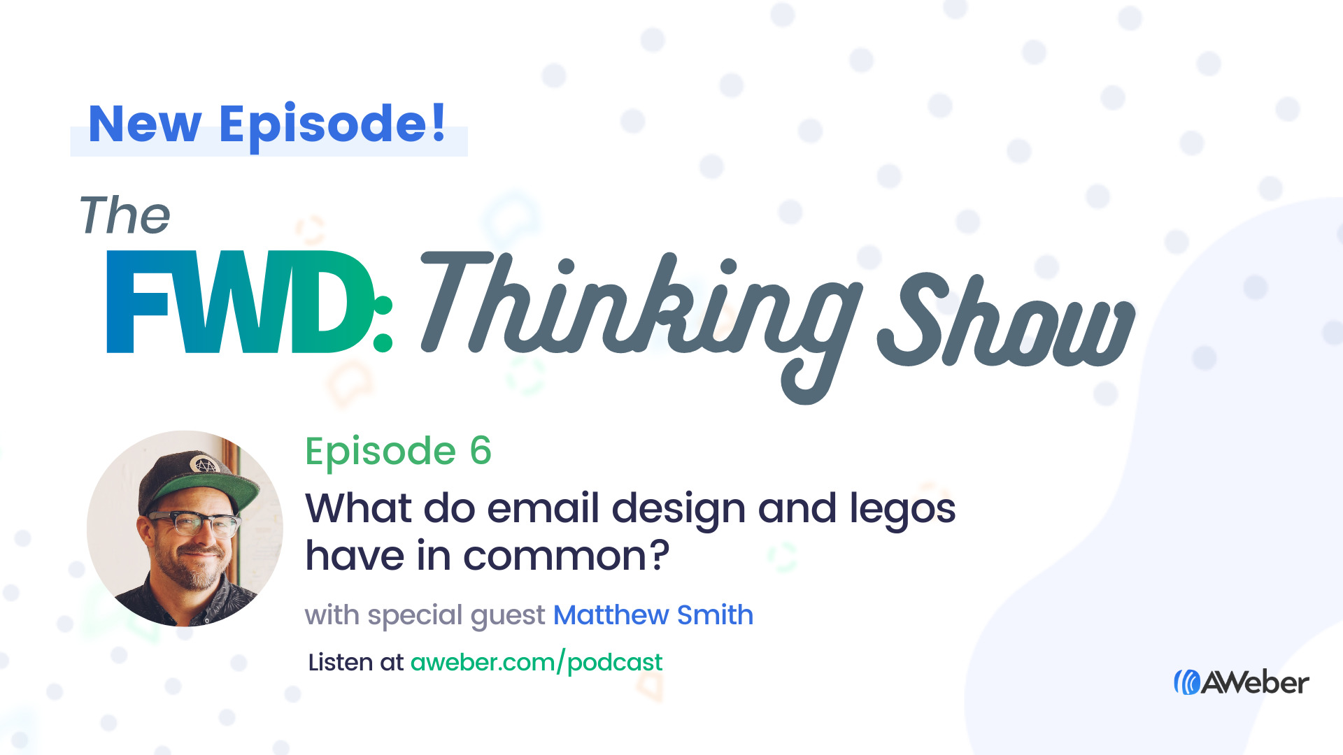
“Email design systems.” Sounds pretty complicated, right?
Not the way Matthew Smith describes it.
As Founder of Really Good Emails and design agency Fathom & Draft, Matthew Smith — otherwise known as “whale” on social media — breaks down email design in a way anyone can understand and implement.
In this episode of The FWD: Thinking Show, Matthew shares his thoughts on the most important elements of email design, how to simplify design using an approach called “design golf,” and how to create an email structure that helps you do more in less time.
Episode summary
Matthew Smith believes email design is a tool for relationship building.
And while design can feel intimidating to small business owners who don’t have formal education or experience with it, Matthew shares that it doesn’t have to be complicated at all.
“Email design systems are like legos. Think of each component — the typography, spacing, headings, and paragraphs — as a building block to build your template.”
This approach to design allows you to create a scalable process that lets you send beautiful emails without a designer faster. And when you move faster you can be more efficient and increase your profitability.
Additionally, Matthew shares that simplifying your email design can be one of the best things you do. He talks about the concept of “design golf” as a system to help you determine if you have too many design elements in your email.
Legos and golf? This episode sounds too fun to read about. Click the button below to listen to the episode now.
Time stamps for interview highlights
4:18: How Really Good Emails came to be
6:15: What’s an email design system?
9:03: Not a designer? Here’s what you need to know about design
10:50: Play “design golf” to optimize your email design
13:20: Email design best practices to make your email easily scannable
16:43: How do email design and email copy work in harmony?
18:30: Some super cool ways to use AMP for Email to make emails interactive
21:10: Email is a relationship builder through every phase of the customer journey
26:15: Let’s put this myth to rest: plain text vs. HTML emails
29:00: What design elements you should split test in an email
34:15: Mathew’s best advice for new small business owners
Learn more about Matthew Smith
Matthew Smith is either two wily bear cubs stacked in a trench coat or a full grown man—some days it’s hard to tell. He runs Fathom & Draft and Really Good Emails, two businesses born from his obsession with designing the relationship between customer and organization. He’s worked directly with clients like Walmart, Seth Godin, Gates Foundation and MIT to blatantly name drop. All of this feeds his talks on design, emotional intelligence, email, business, the euphoria of Japanese Ramen, and The Golden Age of Email—it’s coming, so strap on your spam pants and brace yourself.
Plus, be sure to follow and connect with Matthew on Twitter: @whale.
Get the next episode straight to your inbox
We release new email marketing podcast episodes the first Monday of every month. Want to make sure you don’t miss an episode?
Sign up for the FWD: Thinking newsletter and receive the latest episodes and actionable blog content in your inbox every Thursday, along with email updates from AWeber.
The post What Do Email Design and Legos Have in Common? appeared first on AWeber.
from AWeber https://ift.tt/3ekzA7T
via IFTTT
No comments:
Post a Comment