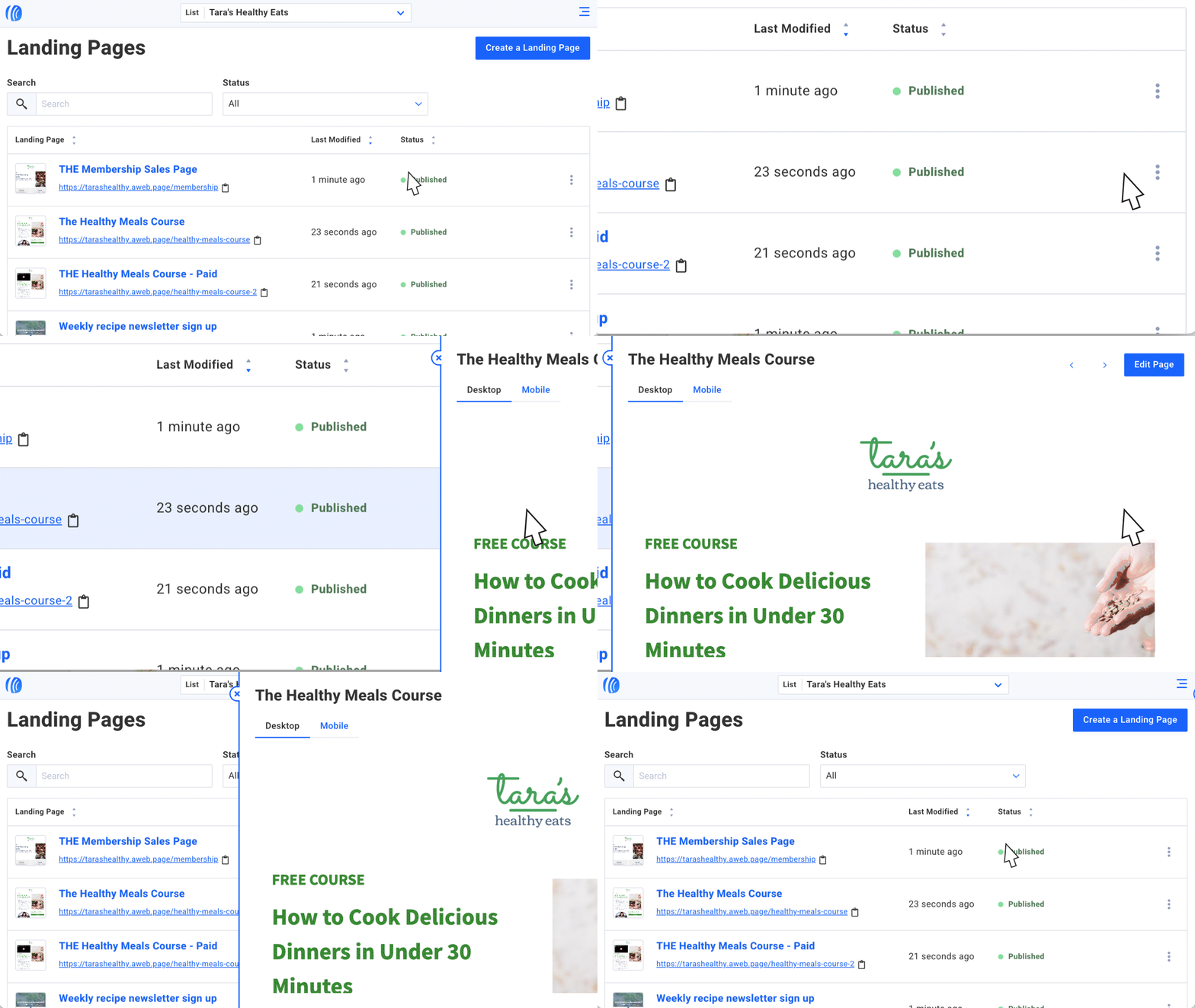
According to a recent survey we did, people who use AWeber love that it’s easy to navigate. It only takes a few clicks to get to any section you need to access — from landing pages and email drafts to subscriber information and web push notifications.
We’ve been working on making it even easier.
Many of your pages — like your list of landing pages or tags — have a new, modern interface and more functionality. They’re searchable, can be filtered based on status, and are easy to read on a desktop or mobile device. Secondary information, like previews and settings, is stowed away until you need it.
Plus, they’re all very similar to look at. We're constantly working to make your experience managing emails, automations, and subscribers simpler and more intuitive so you can get back to what you love.
Let’s check out what’s new for the upgraded pages in your account.
Campaigns
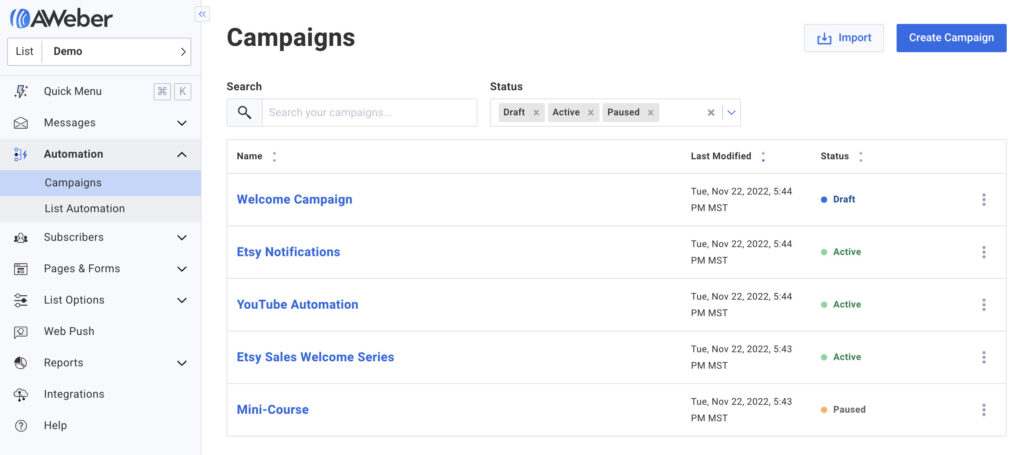
Your campaigns have gotten a huge upgrade, which we went into detail about in this post. At a glance, your campaigns can now be:
- Filtered by status (Active, Draft, Paused, Closing, Stopped)
- Searched by title
- Scanned easily
Simply click on the three dots next to any campaign for options to:
- Preview
- Copy
- Copy to list
- See sharing options
- Activate/pause/close/stop
- Delete
Landing pages
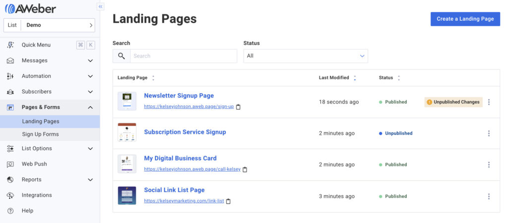
Your landing pages are now easier to search, sort, and scan. They can now be:
- Searched by page name or URL
- Filtered by status (Published, Unpublished, All)
- Scanned easily, with helpful page thumbnails
Hover over any page listing or click on the three dots for options to:
- Edit
- Preview
- Publish
- Unpublish
- Share
- Copy
- Copy to List
- Delete
Custom fields
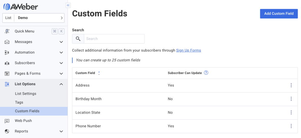
The custom fields page may look a lot different than you remember. But it still has everything you need to manage your custom fields.
Click on the three dots to edit the custom field name, adjust the subscriber update setting, or delete the custom field.
Plus, you can now search for any custom field by name to quickly check it or to make a change.
Lists
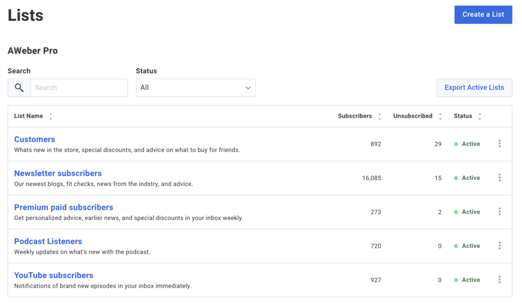
Managing multiple lists at a time? You can now easily find the list you need, get an overview on all your lists, and navigate to the settings for any specific list.
Your lists are now searchable, filterable by status (Active, Inactive, and All), and easy to scan. With a glance, you can see the name and description, number of subscribers and unsubscribed, and their activation status.
Import history
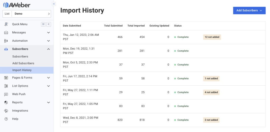
Your Import History page has been updated too. It includes the date each import was submitted, total number of email addresses submitted, imported, and updated, import status, and the number of subscribers not added (if applicable).
Hover and click the three dots for a list of the email addresses not added and why (“Email address is already subscribed to this list,” “Blocked or invalid email (Cannot be added),” “Email address occurred more than once in this import”).
Tags
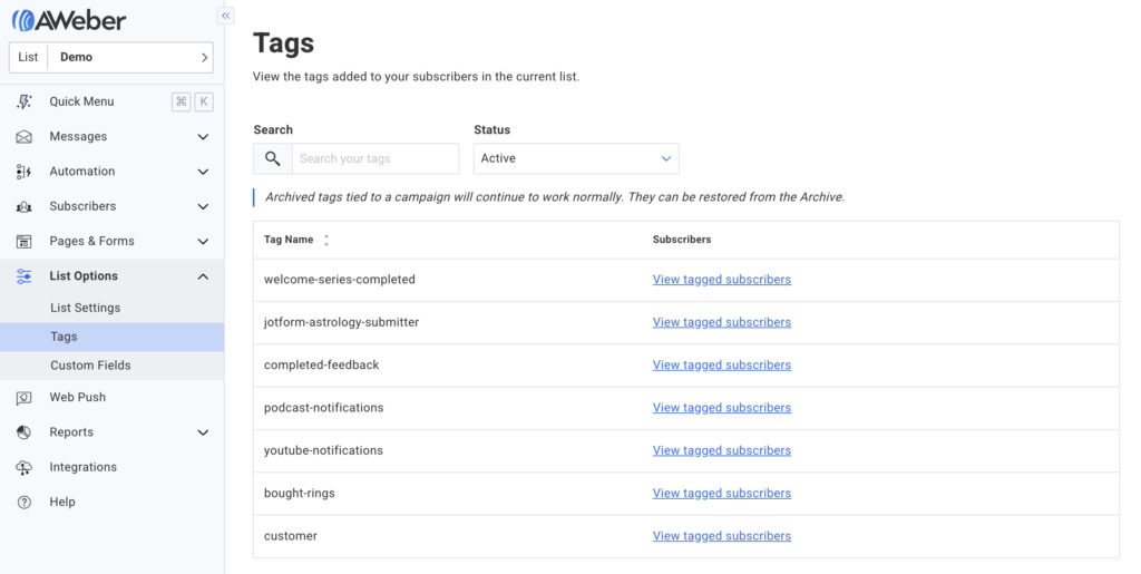
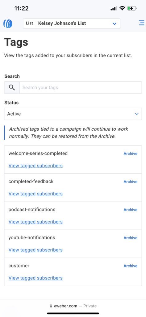
Your tags are now much easier to manage quickly. Search for any tag by name and filter them by status (Active or Archived). You can also click to quickly see a list of subscribers with each tag.
So, if you tag anyone who previously purchased as “customer,” you can search for the tag and click “View tagged subscribers” to be brought to that list. Want to send a special deal to customers only? Create a segment of people with that tag and send a broadcast to just them.
Mobile-friendly pages
Manage any of these pages easily on your mobile device or tablet. They're easy to read and fit completely in one screen. You can publish a landing page, check stats on your campaign, or check subscriber growth on your lists — on the go.
For example, here's the Tags page on a laptop screen:
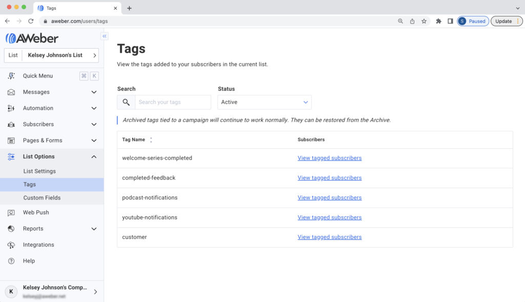
Here's what the same page looks like on a smartphone:
Go ahead — check your account on your phone from time to time. By making necessary adjustments while you're out and about, you can spend less time in your office and more time out in the world!
Watch for future updates
We will continue to make updates that prioritize simplicity and helpful functionality in your account. The faster and easier you can do your marketing, the happier we are. Haven’t tried AWeber yet? Sign up for an account now.
The post Modernized pages: They’re searchable, sortable, and mobile-friendly appeared first on AWeber.
from AWeber https://ift.tt/E2xdyJT
via IFTTT
No comments:
Post a Comment