Picture this: you're rushing to meet a deadline to send your newsletter. You’ve got your content written and your audience is waiting to hear from you but the thought of manually dragging-and-dropping multiple images, buttons, and text elements is making your head spin. You need help, and fast.
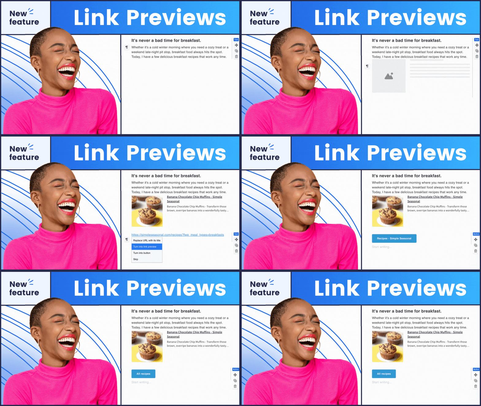
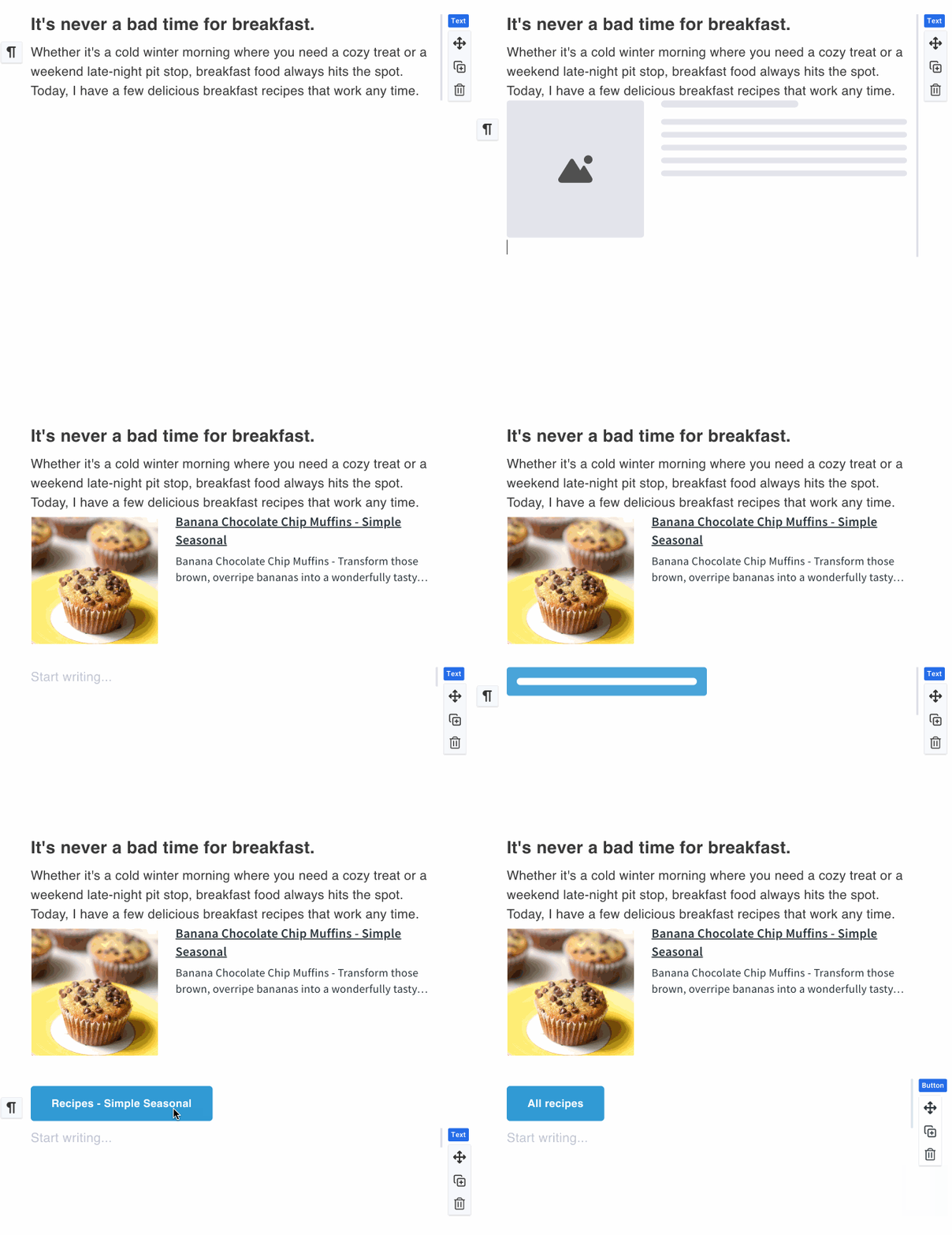
Look no further. With Link Previews, you have the ability to turn a simple URL into a block of well-designed, linked-up content, a video thumbnail, a cta button, or hyperlinked text, with just a single click.
How Link Previews can help you right now
- Save a meaningful amount of time writing your curated newsletter. Curated newsletters are an effective, relatively low-effort way to build an audience in any industry. I go into how I’m doing this myself below in the design space, but here are just a few ideas for how you could do this yourself:
- Cooking recipes.
- News about a specific topic, like tech news, or gardening.
- Helpful YouTube videos for your industry.
- Word of the day newsletter with links to dictionary.com
- Increase click through rate on your sales, onboarding, or instructional videos from Loom or YouTube.
- Make your emails look more professional by replacing a URL with it’s page title. Straight URLs in your email can look unprofessional, and even suspicious.
The killer feature for curated newsletters
Link previews are helpful for all sorts of writers and marketers (I include a list of ways you can use them to engage your audience below), but where they really shine is when you’re curating content in a newsletter. As long as you have a strong intro and a list of interesting links, you can create a well-styled newsletter in a matter of minutes.
I have been using link previews to publish a newsletter about curated design inspiration that takes me just a few minutes to write.
Not just faster, better too
The folks at Explorist.life are some of the busiest creators around. They create weekly YouTube videos for hundreds of thousands of subscribers, produce wiring kits and plans, and… oh yeah they turn vans into solar-powered glamping machines. Email is one of their most important tools to keep their audience up to date on new products and videos.
Steph, one of the owners of Explorist.life had this to say about how link previews help them grow YouTube views.
“I absolutely love the way it looks when I post a YouTube link. It looks really nice with the video thumbnail right in the email and the click-through-rate is way higher when I do that.”
Step from Explorist.life
Link previews are smart enough to understand different types of links and turn them into elements that your readers are familiar with.
| Link Type | Example |
| YouTube Videos | 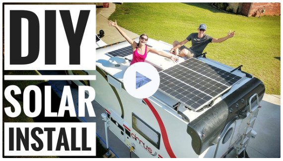 |
| Loom Videos | 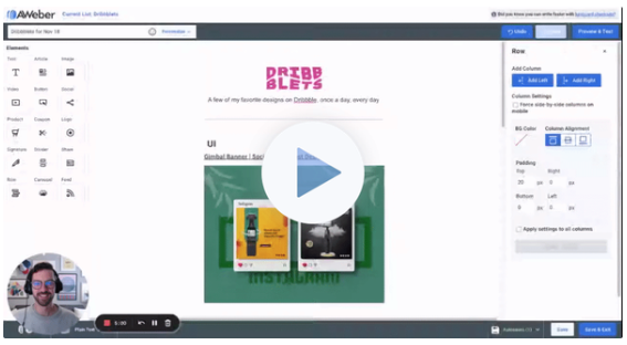 |
| RSS feeds | 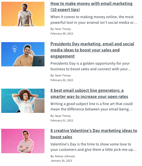 |
| Websites |  |
| TikTok Videos | Coming soon |
| Amazon and Walmart affiliate links | Coming soon |
But did I mention it’s faster? (I’m talking about shaving minutes off your email writing process)
It doesn’t make sense to have to manually recreate information about a website you’re linking to in your newsletter. Copying and pasting page titles, downloading and uploading thumbnails for the site… sheesh.
All this info is already online, shouldn’t your email platform be able to just do it for you?
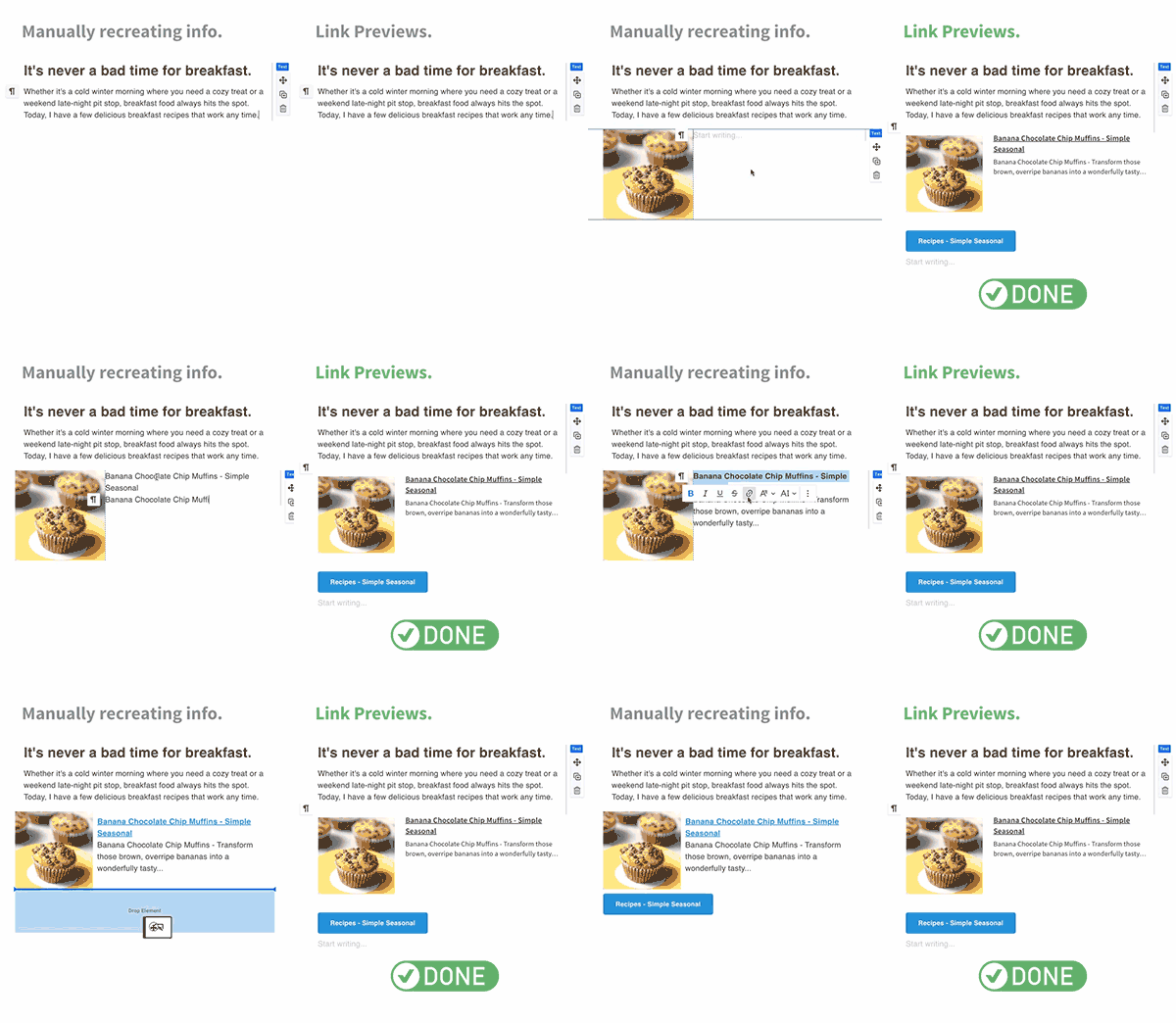
Well, yes. It should. And now we do. All you have to do is paste your link and we’ll create a styled hyperlink, button, or designed block of content.
Start Right Now - It’s Two-Step Easy!
You can start using link previews right now, just:
- Paste or type in a link to a website.
- Select how you want the link to be transformed.
| Replace URL with its title if you have a minimalist or text-focused newsletter. |  |
| Turn into link preview if you want a stylized block of content that includes the site’s image, title, and description. |  |
| Turn into button if you want to focus people onpeople in on clicking through to a single link. In general I wouldn’t recommend you have multiple, stacked buttons; but this is great if you have one site in your newsletter you want people clicking through to. |  |
That’s it. Two steps.
Now it’s up to you. Use link previews to make your emails more effective, and save time to do the things you love. And let me know how we can make this even more helpful for you.
The post You’re spending too much time writing email appeared first on AWeber.
from AWeber https://ift.tt/HLg8Kvr
via IFTTT
No comments:
Post a Comment