
You have an awesome product or service. And you know it adds value to your target audience. All of the marketing research and testing has told you that.
Now all you need to do is convince people to choose you over your competition. But how?
A high performing landing page —also referred to as a Lead Page— will help you not only attract new visitors, but collect their information so you can. send them emails to tell them about the value of your offer.
Whether you’re looking to drive sales, sign ups, or downloads, a highly optimized landing page can provide real value by bringing your visitors to a page targeted directly to their needs.
According to a report by truelist.com, a landing page tailored to the needs of your customer can increase conversion by 300%.
But how do you know what landing page best practices to achieve your desired action? We’re here to help with these 10 steps to create landing pages that convert.
(You can create a landing page in minutes with AWeber's Landing Page Builder)
Keep the Design Clean and Simple
Many landing pages suffer because there’s just too much going on. Approach landing page design with a feeling of respect for the time of the visitor. By making a clear and digestible landing page, you can do more with content because you aren’t forced to slam a loud call-to-action button awkwardly into a crowded space.
Focus on the Primary Goals of the Campaign
Remember, everything about your landing page should be geared towards getting the user to convert. This means removing anything that might draw their attention away from your offer.
Use of White Space
White space is an important part of email landing page design, so make the most of it. Sometimes, what you leave off the page is as powerful as what you include. White space removes congestion and gives the brain space to think. It also forces the eyes to focus on your offer.
Optimize your Landing Page Space
Make your landing page full width and height, and remove navigation features. This isn’t to say you should scrap scrolling completely, but you should take away any visible arrows or buttons that encourage it.
Simple Design Landing Page Example
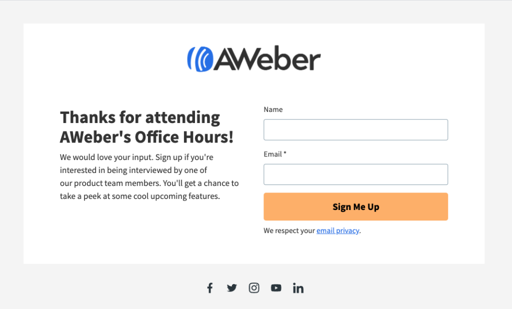
Take a look at how the AWeber landing page keeps things simple and clean. Your focus goes to the benefit headline and then follows a natural path to the call to action button:
Create landing page headlines that hit home
The headline on the landing page is the first thing that visitors see, so it needs to capture their attention immediately and convey your unique value proposition (more on this below). If it’s vague or doesn’t convey a benefit, users won’t stick around long enough to convert.
A landing page will live or die on the strength of its headline. This is what grabs a visitor’s attention and compels them to find out more about your offer.
Landing Page Case Study
Ass many as 80% of people will read the average headline, but only 20% will read the rest of the copy, so it’s important that you nail this part of your page.
Elements of Headline
A good catchy headline should:
- Immediately grab the attention of your visitors
- Tell the visitor what your offer is about
- Be short and sweet
Once the headline has the user invested, you can reinforce your message with a powerful subheadline that persuades them to stay. Your subheadline can go into more detail than the main headline, but you should limit it to no more than a few lines of persuasive copy.
Landing Page Examples Focusing on Headlines
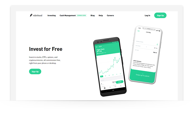
This example from Robinhood is as simple yet powerful, due to the strong headline.
Get proven, eye-catching landing page headline formulas in our guide, How to Write Landing Pages That Convert.
Grab attention with landing page images
Humanizing your offer can make it more relatable. One of the easiest ways to do this is using a relevant image. Images play a huge part in converting visitors. They’re the first thing that catches the their eye before they read the headline.
Images are processed 60,000 times faster than text by the brain, so what the visitor sees will influence their immediate opinions about your brand and offer.
Like headlines, use imagery to grab attention. Make them relevant to your product or service.
- If you’re offering a product, your imagery should be of the product
- If you’re offering a service, your imagery should relate to what the service is in a way that paints a positive picture in the mind of the user
Remember that you don’t have long to make a good first impression. Make sure images are large and high-quality. Try to stay clear of stock imagery — you don’t want to show visitors something they may have already seen.
Landing Page Image Example
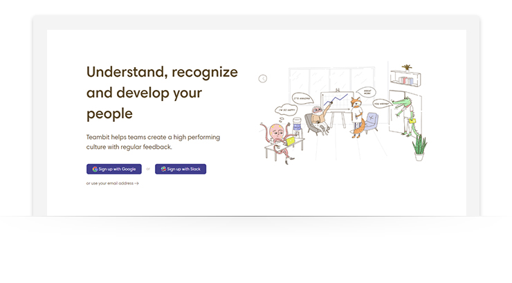
Teambit is a great example of imagery done well — original illustrations used to capture attention and promote its service:
Talk up the benefits
Let’s face it: the average attention span is shorter than ever – eight seconds, to be exact. So when you craft large blocks of text, you risk lower engagement and fewer conversions.
As a result, you want to write copy that’s easily scannable and highlights the most important elements. This way, visitors can quickly determine whether your solution is right for their needs.
The Benefits of Opting-In Need To Be Clear
When it comes to writing out the benefits of your offer, focus on clarity. Clearly explain how what you’re offering can solve the user’s problem. But do it in as few words as possible.
According to MarketingProfs, landing pages with more than 800 words have a 33% lower conversion rate than pages with less than 200 words. Bullet points are a great way to keep things concise and make benefits easily digestible for the user.
Bullet points also allow you to use minimal text and draw attention because of the way they’re styled. And when you combine bullet points with white space you increase their effectiveness even more.
Establish your USP
Your USP (Unique Selling Point) is the thing that sets you apart from the competition and the reason why people will choose you over everyone else.
Studies show that you have less than 15 seconds to capture someone’s attention when they land on your website. That’s how long they’ll stick around before deciding whether what you’re offering is right for them. So you need to impress them quickly.
What’s in a Value Proposition?
Value propositions include:
- Showing how your product or service compares against a well-known competitor
- The ROI that can be achieved
- The monetary value of the product and the saving that can be made by signing up now
- The success that can be achieved
- Making it clear that your offer is free
- A guarantee
Define a strong, value-driven USP and build your landing page around it. You can complement your USP with strong headlines,images, and relevant copy.
A value proposition is a key component of your small business marketing strategy, and shows the user what they’ll gain when they take action, whether that is filling out a form or making a purchase.
Unique Value Proposition Landing Page Example
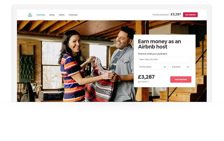
Airbnb does this brilliantly. Take a look at how it pairs its USP (earning money by renting a room in your home) with a value proposition (how much you could earn by becoming a host).
Make calls-to-action strong and clear
Every element of your landing page is designed to get visitors to notice and click on the call-to-action.
The golden rules of form optimization are to keep it concise and feature a compelling, unique call-to-action.
If your form is too long, you may scare visitors away because you’re requesting too much information. And if your Call-To-Action (CTA) isn’t personalized or it’s difficult to find, you jeopardize the chances of converting your visitor into a customer.
Standard Call-to-Action Rules
- Make it big enough not to be missed
- Always use a button. People are conditioned to expect a button, don’t throw a curveball at them
- Use a contrasting color that attracts the eye
- Use actionable words (e.g. “Get your Free Trial,” “Buy Now,” “Download Now,” etc.)
Powerful CTAs are an important part of successful landing pages. You don’t want to make visitors guess or even have to think deeply about an action. The CTA should be obvious and ready to capitalize on your desired action.
Depending on the length of the landing page, you may need to incorporate multiple CTAs throughout the content.
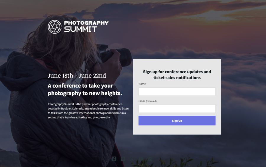
Call-to-Action Example
Include contact information
Contact information tells the visitor that you’re a real company. It lets them know that there’s someone behind the landing page, which increases trust.
Including a physical address and contact phone number is the most basic way of adding legitimacy. What those things don’t do, though, is encourage contact. If you want to be helpful to visitors, give them a way to get in touch online. There are three ways you can do this.
- Include a chat pop-up that follows the visitor down the page, making you available to answer any questions
- Include a contact form on the page
- Include a contact call-to-action that clicks through to a dedicated contact page
Find an easy to use Landing Page Builder
Once we lay out what it takes to create a high converting landing page, it sounds pretty easy. But if it doesn’t, don’t worry, plenty of small business owners either don’t have the time or know-how to create a website landing page to help create additional business opportunities.
Luckily, there are platforms available which make creating and optimizing your landing page super easy.
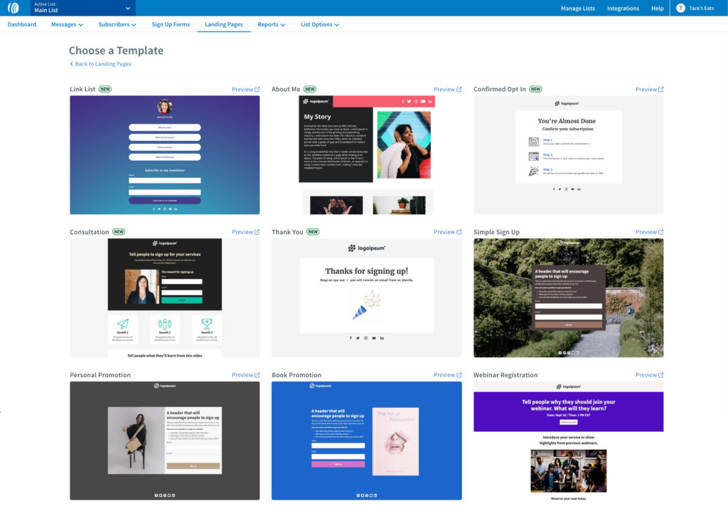
AWeber’s Landing Page Builder will allow you to create visually stunning landing pages with our easy drag-and-drop editor. Want something even easier? No problem, your landing pages could be ready in minutes. Just choose any of the hundreds of landing page templates available. And the best part, they’re all free as part of AWeber Free.
AWeber Landing Page Template Examples
Test, test, test
Landing pages are trial and error. Once you’ve created a page you’re happy with, don’t put it live and just leave it. Always monitor performance. Look at your analytics weekly and look at performance over time. Use heatmaps and scrollmaps to see how people are interacting with the page and use the information to improve your landing pages performance.
If your page isn’t bringing in the number of leads or conversions you expected, tweak elements of the design or copy, or tinker around with the color and positioning of buttons.
Then, run A/B tests to see how the different pages perform against one another. From there, you’ll be able to take the best elements of both to produce a page that gives you bang for your buck.
Use Search Engine Optimization to drive landing page traffic.
Remember that your landing page is public, so it has the potential to be discovered by people who are typing specific search queries into a search engine such as Google. So make sure that you can maximize that public value by following some basic SEO strategies.
Make sure the page itself is crawlable, so you’re not blocking it from search in the robots.txt file or through noindex tags. You also want the page to have some clean HTML markup with crawlable text and a strong title tag, meta description and URL (some basic guidelines from Google for reference). Put the page into Google’s Keyword Planner to get ideas for keywords you could incorporate into some of these elements. Run your email landing page through Google Search Console to check crawlability.
Establish Your Brand
Since visitors from organic search traffic may be completely unfamiliar with you, make sure that the landing page represents your brand in a meaningful way. You don’t need to sacrifice any specific language or design pieces; just make it easy for your page to live on its own and do more outside of the campaign.
Landing page content often has some extremely good value for long-tail keywords, so some basic landing page SEO can provide new traffic for a long time, providing extra value on top of your initial email landing page investment.
Conclusion
As you optimize your landing page, be sure to reflect on what’s working and what isn’t. Then test new ideas and tactics to continue improving your conversion rates.
And remember – once your prospects sign up for your product, service, or email list, the work isn’t over yet. It’s time to keep them engaged by sending related content offers, freebies and more through AWeber’s email marketing platform.
Your landing page converting is a sign that it’s working, and people are putting their trust in you to deliver on what you say. Repay trust and reward loyalty by emailing customers with content that adds value, personalized offers, and freebies, or letting them know when they left items in their cart. Every dollar spent on email marketing has an ROI of $44. Once a person has opted-in to your email list, use it to your advantage.
Related: How to Get Your First 50 Email Subscribers in 30 Days
Not sure what to include in your emails? Download 45+ free writing templates to learn how to craft emails like a pro.
About the author: With nearly a decade of digital marketing experience, Chandal has created content strategies for both the biggest and sometimes the most unexpected markets, while developing strategic relationships with editors and publishers. Chandal contributes to some of the highest authority industry publications, has been featured in industry events and is thrilled to be Acquisio’s Content Director.
The post 10 Steps to Creating a Landing Page That Converts appeared first on AWeber.
from AWeber https://ift.tt/311l7HB
via IFTTT
No comments:
Post a Comment