
Your confirmation email is an important first impression. It sets the tone for your relationship with subscribers and can improve engagement for future emails.
Picture this - you just booked your dream vacation online. But you never received an email confirmation. You may be wondering if your order was processed. Now you have to spend time contacting the travel agency to make sure your vacation was booked. That is not a good experience.
You wouldn’t want to do that to your customers. That’s why you need to set up a good confirmation email.
In this article, you’ll learn:
- What is a confirmation email?
- Types of confirmation emails
- Why should you send a confirmation email
- Difference between confirmation and welcome emails
- How to set up a confirmation email
- How to write a confirmation email
- 8 awesome confirmation email examples
What is a confirmation email?
A confirmation email is a transactional email that is set up to automatically go out to someone who just took a specific action, such as placing an order, subscribing to an email list, or registering for an event.
Types of confirmation emails
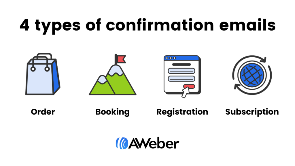
There are four main types of email confirmation messages:
- Order confirmation – confirms the transaction of a product or service
- Booking confirmation – informs a customer that hotel, flight, and other travel arrangements have been made
- Registration confirmation – provides confirmation that customer is registered for upcoming event
- Subscription confirmation – also called an opt-in email, requires customers to confirm their email address to complete opt-in process
Why should you send a confirmation email
Sending a confirmation email is an email marketing best practice because it:
- Reassures your customers that you received their information.
- Gives customers peace of mind that their request was processed.
- Establishes confidence and trust with your brand.
- Prevents mistyped and fake email addresses from cluttering up your list.
- Improves deliverability. Typically, when you send a subscription confirmation email, you require the subscriber to click a link to confirm their email address. This is referred to as a double opt-in, and it can often lead to more emails reaching your subscribers’ inboxes.
Difference between confirmation and welcome emails
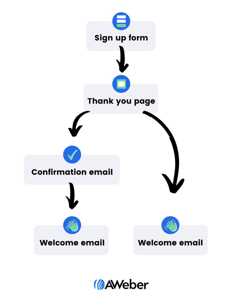
A confirmation email is similar to a welcome email, but it serves a different purpose. The graphic below shows when a confirmation email is sent within a subscriber’s onboarding sequence. Welcome emails, as you can see below, happen after a new subscriber is confirmed (or after an order is confirmed if an order has been placed).
For more information about welcome emails, including how to write one, see our blog post, Welcome Email Campaigns: How to Onboard New Subscribers.
How to set up a confirmation email (in 5 easy steps)
Before you can set up your confirmation email, you’ll need to sign up with an email marketing service provider (ESP), such as AWeber.
Step 1: Build your confirmation email
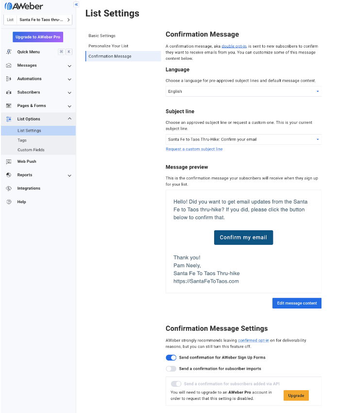
You have two options for building your email - use a drag and drop builder to pull the elements you’d like to include in your emails, or you can begin with a pre-built template. Some email marketing services already have confirmation email templates you can use.
Here’s what the setup page for AWeber’s confirmation template looks like.
Step 2: Write your confirmation message
Your confirmation email should be short and direct. The email should also confirm their transaction.
In the next section, we’ll review how to write your email and what elements are needed for each type of confirmation.
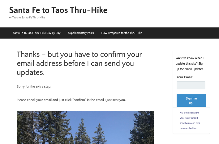
Step 3: Create your confirmation landing page, aka your “thank you page”
Setting up a landing page is an important part of the confirmation email setup. Why? Because it lets people know that their information was received. It establishes a good first impression by thanking them for their order or for signing up to your email list. And it directs people to check their inbox for more information.
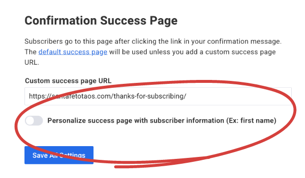
AWeber’s free and paid plans let you specify a custom confirmation landing page, or you can use AWeber’s default confirmation page. You specify your confirmation landing page within the signup form settings for the signup form that triggers the page.
Here’s what this looks like within an AWeber account.
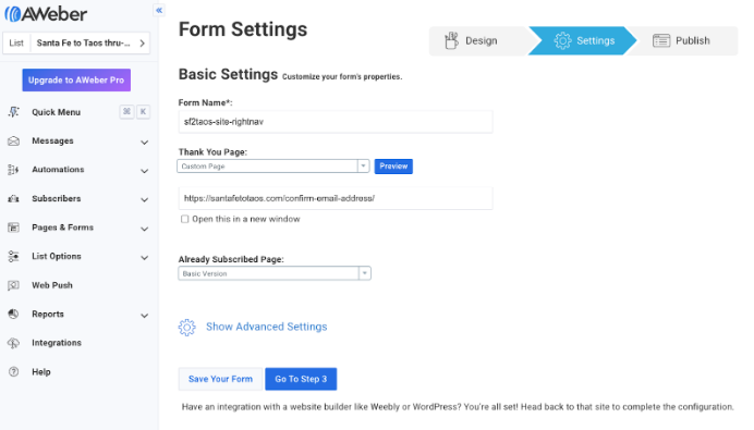
Here’s the custom thank you page that you saw the link to in the image above. It’s very simple, but it lets new subscribers know their information was received and what they should do next.
Related: How to create a landing page in 8 steps
Step 4: Set up your confirmation success page
This is the page a new subscriber sees after they’ve confirmed their email. The success page is only needed with an email confirmation.
Here’s an example of what a success page looks like:
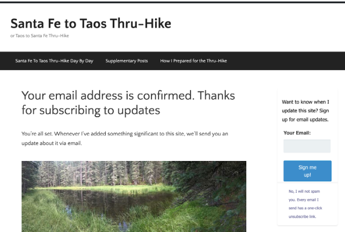
Your success page can look however you want it to look. It can be hosted on your website, or you can set it up so people go to your Facebook page or your TikTok profile after their email address is confirmed.
AWeber customers can also personalize their “success page” with each new subscriber’s information (like with the subscribers’ first name for example) or with whatever other information that was requested in the sign up form.
Step 5: Set up your automation
By automating your email, you can connect with your subscribers immediately and automatically. (Plus, save your time!) And with the correct writing strategies, your emails will be compelling and sound human, instead of robotic.
How to write a confirmation email
At its core, a confirmation email is just that what it sounds like. Its purpose is to “confirm” that you received their information or order. But depending on the type of confirmation email, your email will be structured differently.
A common element each email should have is a “thank you.” It’s important to let your customers know you appreciate them. This could be included as a headline or in the first sentence.
Here’s how to write the rest of your confirmation emails:
Order confirmation
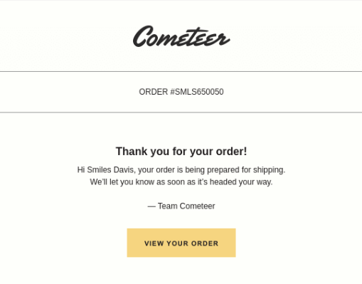
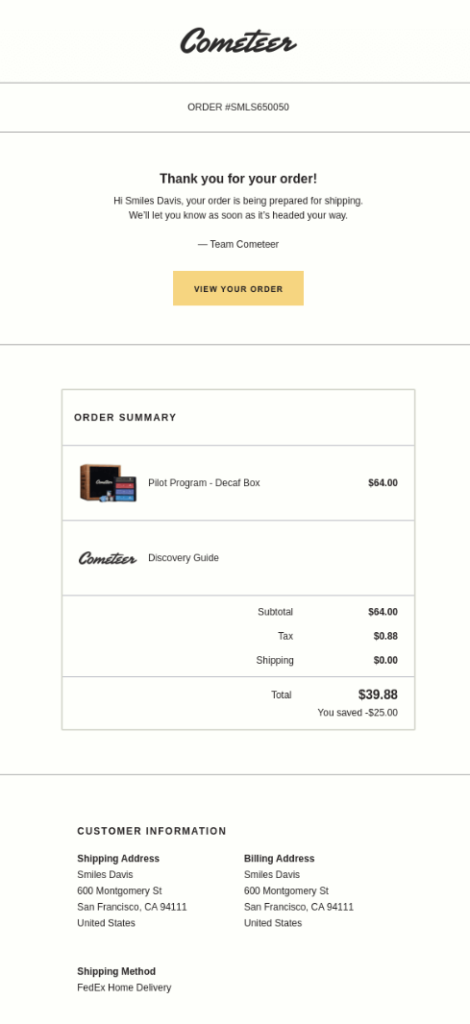
Your order confirmation email should contain one or two sentences to include a thank you and information about when their order will ship. This could be as simple as “We will send you another email as soon as your order ships.”
See how Cometeer starts off their confirmation emails.
People who place an order online will often save their confirmation email so they can reference it later. So make it easy for them to find the information they may be looking for, which should include:
- an order number that can be referenced
- a list of what they ordered
- a summary of their contact details including the shipping address.
- a link to track their order status
See the full Cometeer email. This very simple approach is all you need for an order confirmation email.
Booking confirmation
Provide the details of what was booked including:
- the name of the person
- confirmation number
- the date(s) and time if relevant of the reservation
- location
- any other relevant information
You may also want to consider a message regarding changing their reservation or adding contact information.
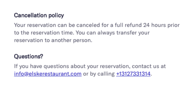
Tock at Elske, a restaurant in Chicago, adds a section for their cancellation policy and questions at the bottom of their confirmation emails.
Registration confirmation
Start your registration confirmation email off with the event name and date. You can also add a convenient “add to calendar” button. This makes it easy for people to add the event to their calendar, increasing the chances they attend the event.
See how VentureBeat structures their webinar confirmation email:

Subscription confirmation
It’s important to have customers verify their email address. It’s essentially having the customer say “yes, I want to receive an email from you,” twice. This helps you improve your delivery rate and get higher email engagement.
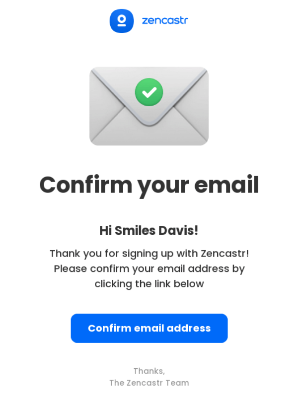
Your copy can be as simple as “Please confirm your email address”. And have a call to action with “Confirm your email”. That’s it, no need to overthink this email. More details about you can be provided in your welcome email.
This email from Zencastr leaves no doubt what action they want subscribers to take.
8 awesome confirmation email examples
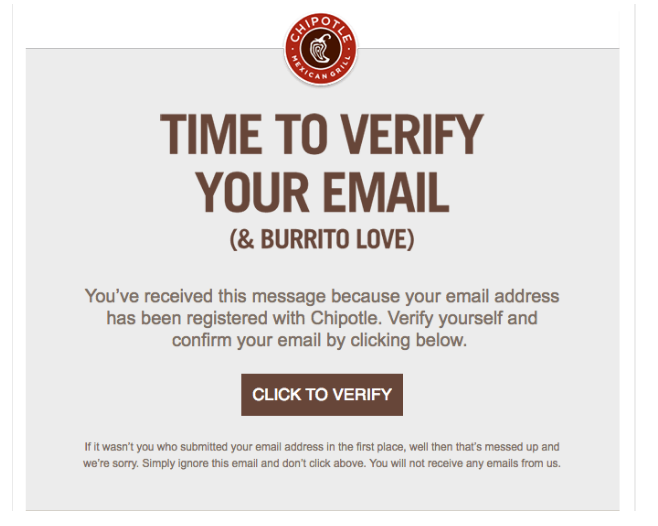
1 - Chipotle
Why it’s awesome:
Chipotle’s subscription confirmation email, also known as a confirmed opt-in, explains why subscribers are receiving this message and exactly what they should do.
2 - AWeber
Why it’s awesome:
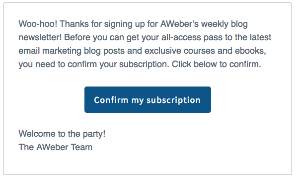
In the confirmed opt-in email for our AWeber Blog Newsletter below, we tell subscribers about the benefits of being on our list (free blog posts, courses, and ebooks!). This helps to improve the conversion rate of our confirmed opt-in email.
Once subscribers confirmed their email, it’s time to officially welcome them to your email list.
3 - American Airlines
Why it’s awesome:
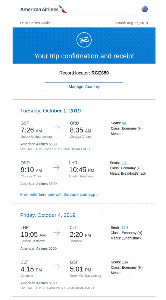
American Airlines doesn’t overdo the email with text. They keep it simple by just providing the essential information.
4 - Allbirds
Why it’s awesome:
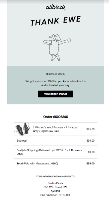
Feel free to keep your confirmation emails on brand, like Allbird with their unique way to thank “ewe” (clever).
5 - Codeverse
Why it’s awesome:
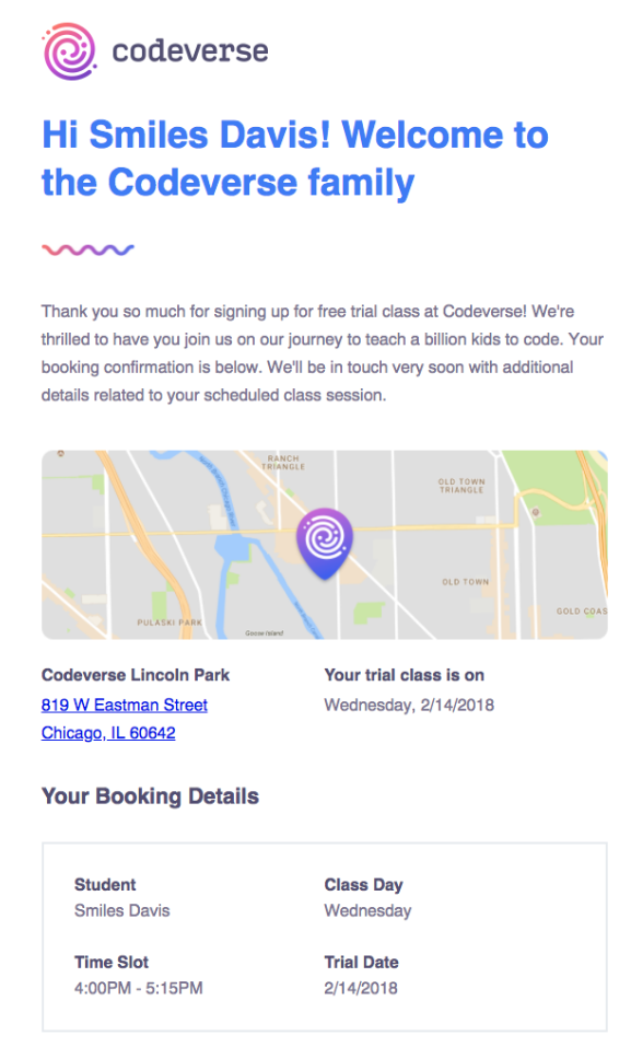
Your confirmation emails may be saved and referenced at a later time, so include any and all relevant information. Codeverse does this well by including the date, day, time, participant, and location.
6 - BEE
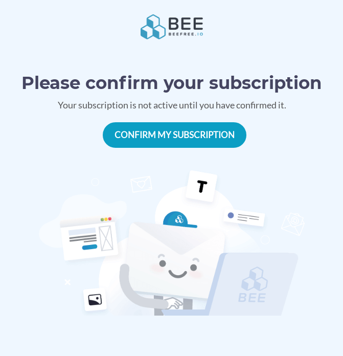
Why it’s awesome:
BEE is clear and upfront - your subscription will not be activated until you confirm your email. This will help make sure a high delivery rate and a more engaged audience.
7 - DoorDash
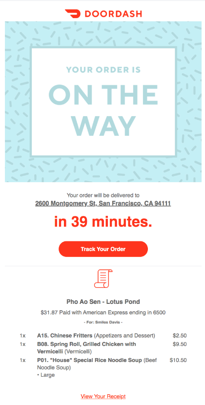
Why it’s awesome:
DoorDash sets the expectation up front with a countdown timer on when you can expect your order to arrive. They also provide a link to track your order along with a confirmation of what was ordered.
8 - Hipmunk
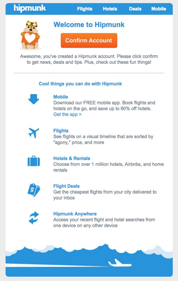
Why it’s awesome:
If you need more incentive to confirm your email address, Hipmunk includes a list of cool things you can do in your account.
Help writing confirmation emails
Need a little help or inspiration figuring out how to write your emails. We’ve got you covered with our Free What to Write Guide.

Get started with your confirmation emails! Create your FREE account with AWeber today, and change the way you send emails forever.
The post How to write confirmation emails your audience will love appeared first on AWeber.
from AWeber https://ift.tt/RJ8yr0M
via IFTTT
No comments:
Post a Comment