
Landing pages play a pivotal role in driving successful campaigns, they let you simplify your message while keeping your customer focused on a desired action.
In today's fast-paced digital landscape, where capturing attention and driving conversions is more challenging than ever, the strategic use of landing pages has become a necessity for businesses and marketers alike.
But there are different types of landing pages for different situations. We’ve highlighted the top 12 most impactful landing pages including when to use them.
Webinar landing page
In-person or virtual events — like webinars — are a great way to educate your audience and to get them engaged with your brand. These are no small tasks to put together. A lot of your time and energy is spent on the planning and execution of these events. But without a webinar registration landing page, your hard work will go unnoticed.
The features that your event landing page needs to have are:
- Headline with your event name
- Sign up form
- Copy explaining why someone should attend
- Dates and time (make sure to include your time zone)
A webinar landing page is designed to attract and inform people about a webinar. It acts as a virtual invitation, providing details such as the topic, date, time, and speakers.
When to use
This type of landing page is used when you want to inform people of an upcoming webinar and give them an easy way to sign up.
Webinar landing page example
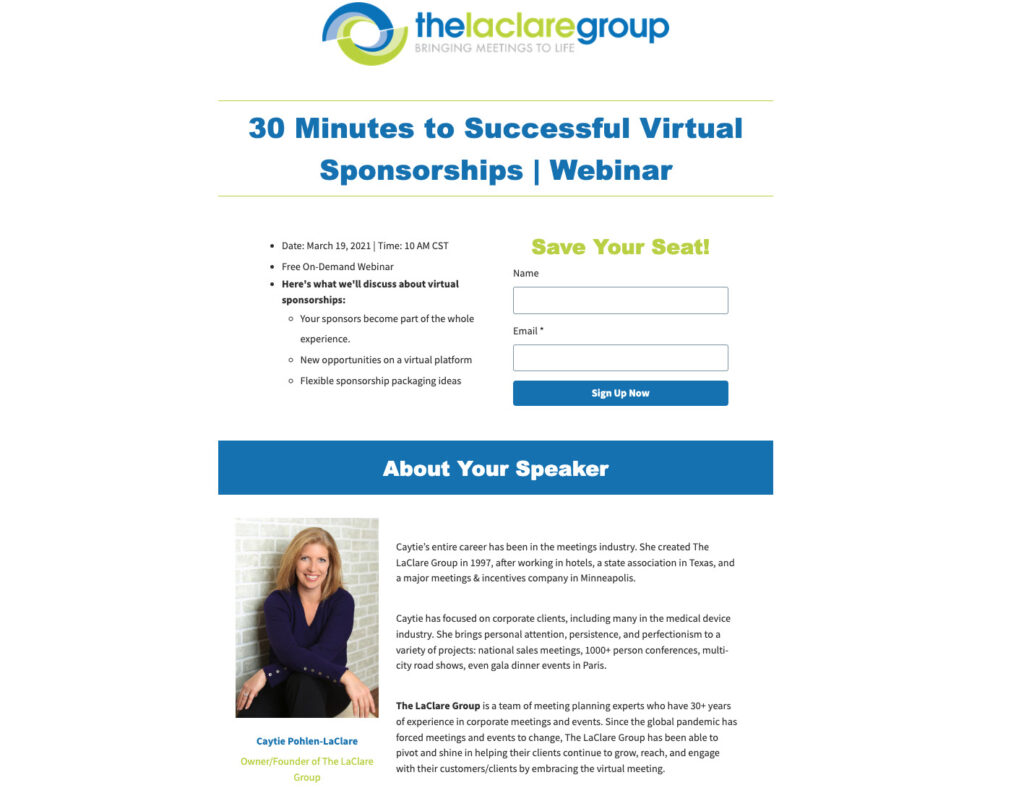
What I like:
- The “Save Your Seat” header is a great way to imply there may be limited slots available. This could potentially drive increased sign ups.
- The “About Your Speaker” section which helps provide credibility.
- The entire landing page will fit within most desktop view ports without having to scroll.
Ebook landing page
An ebook landing page is specifically created to promote and offer an electronic book (ebook). It serves as a destination where people can learn about the ebook's content, benefits, and either purchase or download it.
When to use
Many aspiring entrepreneurs are looking to make money by selling ebooks online. By producing the ebook and selling it online, many business owners are bypassing the traditional publishers, print presses, and distribution centers.
Ebooks can also be used as a lead magnet to grow your email list.
Ebook landing page example
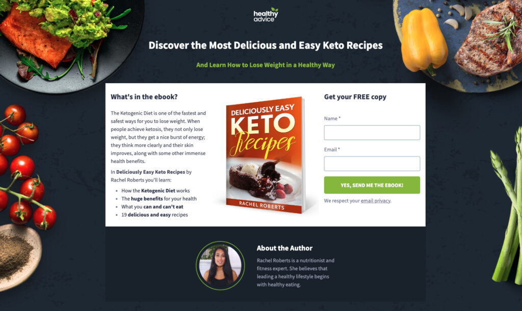
What I like:
- Great explanation for what’s included in the ebook.
- Action-oriented call to action - “Yes, Send me the ebook”.
- Selling the value of the ebook with a strong headline.
- About the author section helps add credibility regarding the contents of the ebook.
- Visually appealing landing page background.
Ecommerce landing page
An ecommerce landing page is specifically for selling products online. Think of it as a shop window on the internet, showcasing products, providing descriptions, prices, and a simple way for customers to add items to their shopping cart and complete their purchase.
When to use
Creators who start off selling their products on marketplace shops such as Etsy. But eventually after they build a loyal customer base, they will create an ecommerce landing page to sell their products, eliminating the marketplace’s transaction fees.
Or creators looking to sell digital products. They can send their existing audience to these landing pages to purchase the digital product or they can try to drive new customers through paid advertising.
Ecommerce landing page example
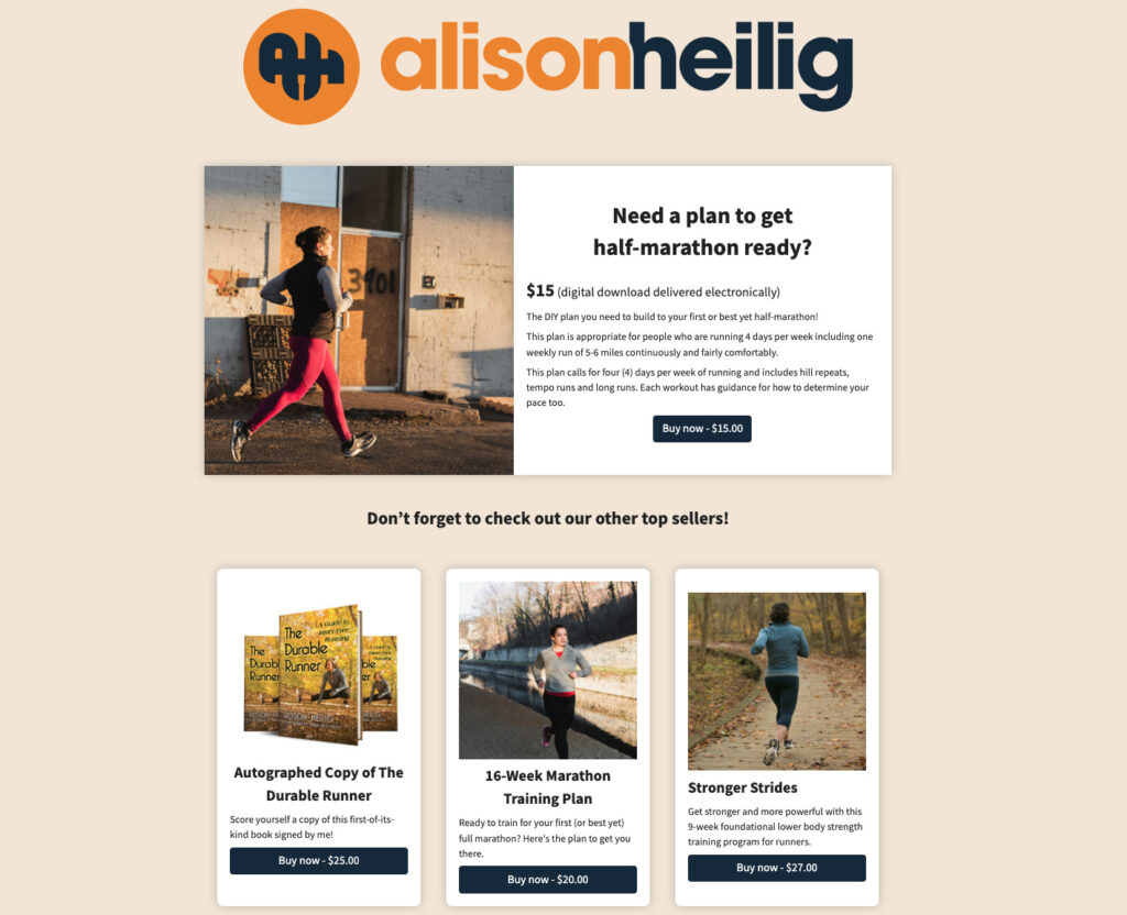
What I like:
- Includes popular products available as an upsell
Lead magnet landing page
Lead magnets are a great way to incentivize a potential customer to provide you their email address. But in order to capture those email addresses, you need to create a lead magnet that provides a desired value for that individual.
Once you’ve created your incentive, the next step is to build a dedicated landing page to capture that email address. Your communication needs to clearly explain the freemium they will receive and the main benefits of that lead magnet.
After you have their email, you can now begin marketing your product or service.
When to use
This type of landing page is used when you want to increase your email subscribers.
Lead magnet landing page example
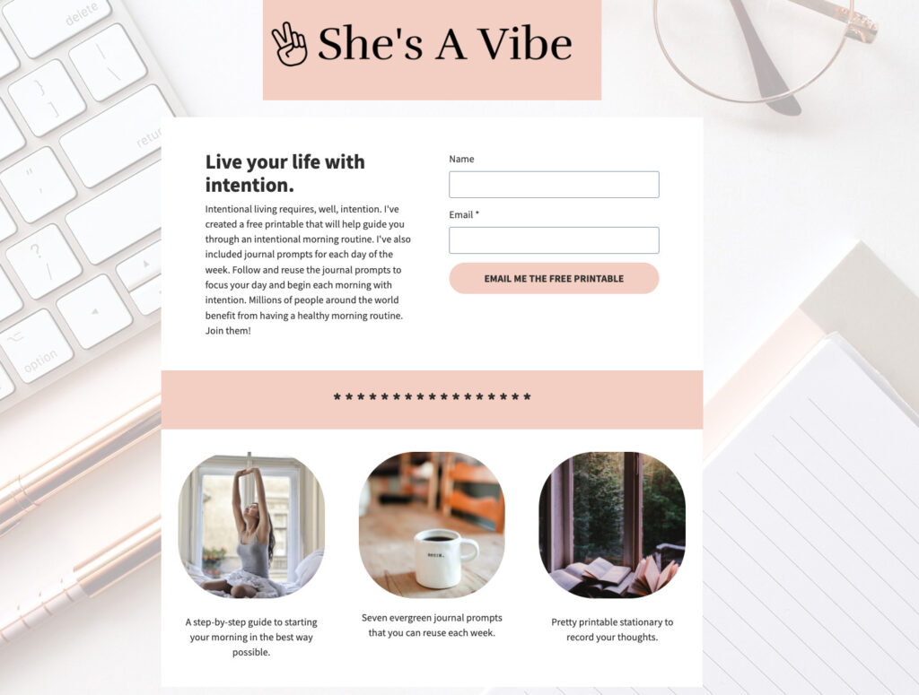
What I like:
- Simple, straightforward, easy-to-read landing page.
- Break out the three main elements that you will receive.
Squeeze page
A squeeze page is a type of landing page that’s used to collect (or “squeeze” hence the name) a visitor’s email address.
Squeeze pages differ from other types of landing pages in that they are usually much shorter and only ask for an email address. Other pages, for example a lead magnet page, may ask for other information such as first and last name.
When to use
When you want to grow your email subscribers.
Squeeze page example
While this landing page example could also be considered a lead magnet landing page, this could also be considered a squeeze page do to the single email field request.
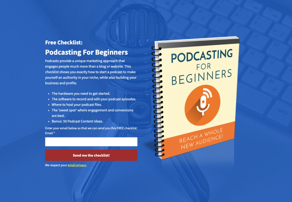
What I like:
- Bulleted list of what you get with the lead magnet
- The red CTA draws your attention to the main action
- The background image ties in to the incentive
Podcast landing page
Podcasts have become one of the most popular mediums. In 2013, 10% of the population listened to a podcast monthly, and that number is now 37%.
There are over 48 million podcast episodes. Standing out from the rest becomes a lot easier once you have a landing page to promote your podcast. You can no longer rely on listeners finding your podcast on one of the streaming platforms. To be successful, you can have a summary page for each podcast episode.
When to use
Podcast landing pages are used when you want to promote a single podcast or to collect email addresses so you can communicate future episodes.
Podcast landing page example
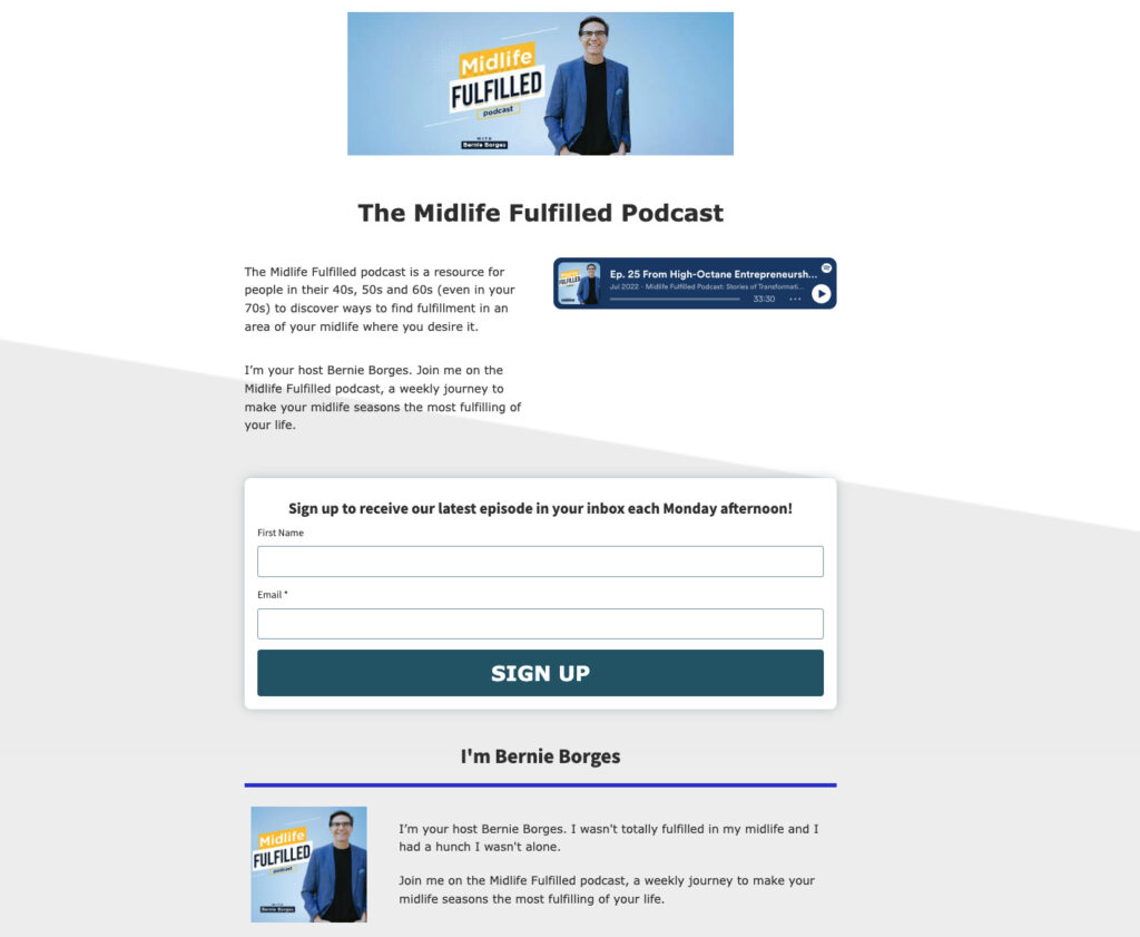
What I like:
- Set’s expectations for when someone who signs up will receive emails. This transparency can help convert more visitors.
- Embed a podcast episode. This could also help convert more visitors as it gives people who have not heard an episode a chance to listen before providing their email.
PPC landing page
One of the most important things to keep in mind about paid ads is to make your landing page relevant to the keyword being searched.
Imagine a potential customer searching for “best italian restaurants near me” and the page they click is about the best italian food recipes. Not a very good user experience.
And it will certainly be a waste of your money. Given the search term was for ‘best restaurants,’ it’s safe to say they’re not in the mood to cook tonight.
So every keyword topic you want to bid on, you need a relevant landing page for your Google Ads or other search engine.
For PPC (pay per click) ads, making sure your landing page is relevant is not only important from a conversation (or desired action) standpoint, it is also necessary to improve your quality score. A better quality score in Google often leads to lower prices and better ad positioning.
When to use
When you set up a paid ad and need to send your traffic to a targeted landing page that’s specific to the search term.
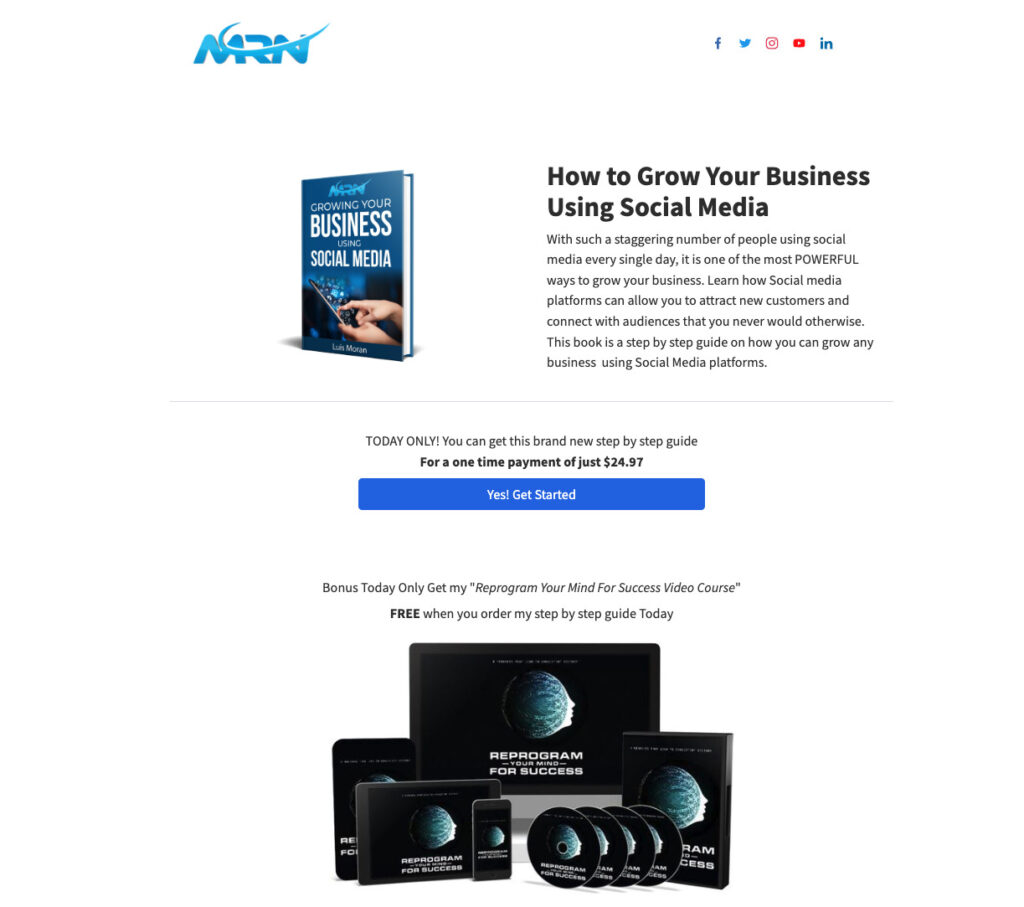
PPC landing page example
Thank you page
Did you set up a webinar landing page or how about one to capture email addresses? If so, then show your appreciation with a dedicated landing page to thank them for signing up for your event, downloading your lead magnet or purchasing your product.
This page doesn’t need to be complicated. A simple thank you along with next steps, depending on the offer, is all you need.
When to use
A thank you landing page is typically used after a user completes a desired action, such as filling out a form, making a purchase, or subscribing to a newsletter. It serves as a way to express gratitude and provide further instructions or information.
Thank you page example
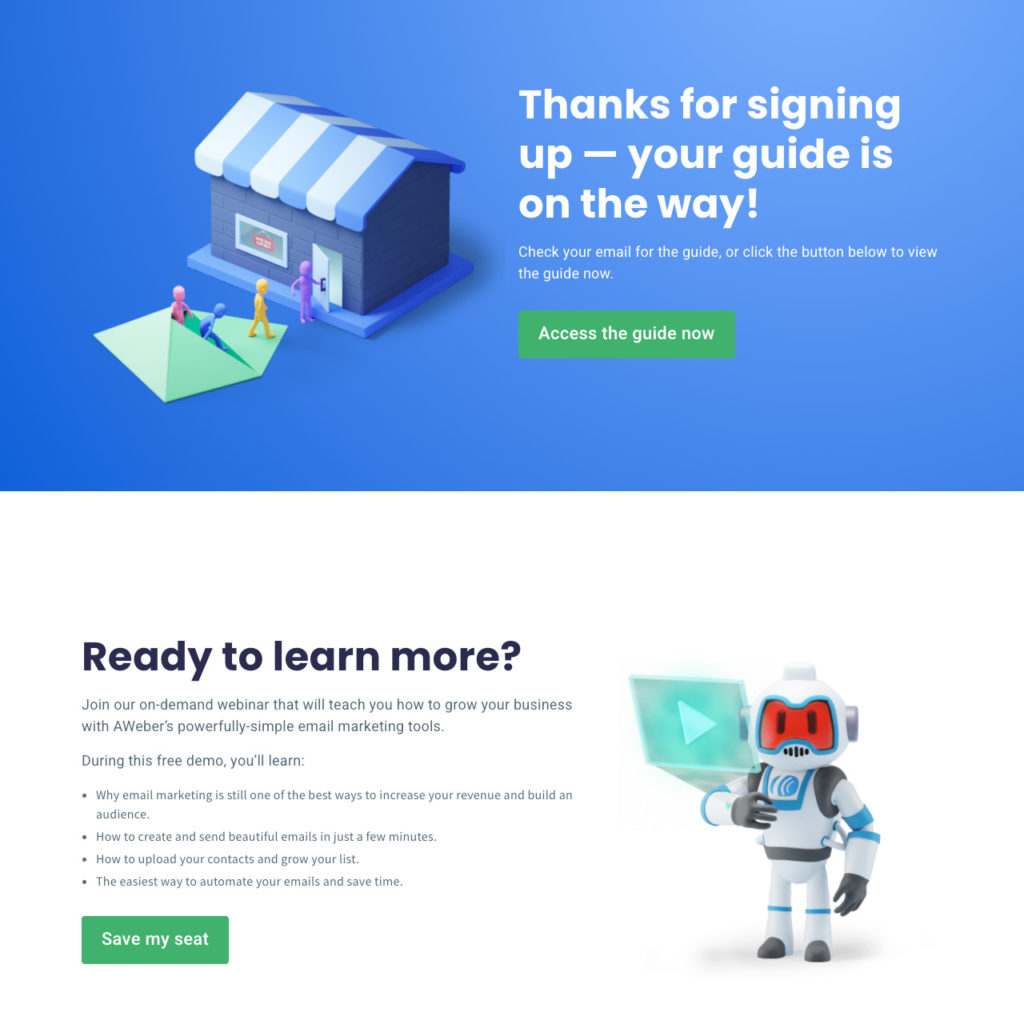
What I like:
- The thank you page is used to fulfill the lead magnet
- Offers an upsell for an on-demand webinar
Video landing page
A video landing page is used to add additional value for the page’s main content. It is designed to capture the attention of visitors and highlight information or a message through video format.
When to use
Video landing pages are often used to promote products, services, or events, providing an engaging and visual way to present information.
For example, a company may create a video landing page to showcase a new product, demonstrating its features and benefits through a captivating video presentation.
Video landing page example
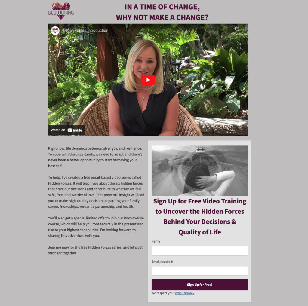
What I like:
- They show the importance of the video by placing it at the top center of the landing page.
- The headline above the call to action adds the benefit for why someone should sign up.
Link-in-bio landing page
A link-in-bio page, also known as a bio link page, contains a collection of links to various online resources.
It’s most commonly used in the bio section of social media profiles, where users are limited to including just one clickable link. A link-in-bio page serves as a workaround to that limitation, allowing users to provide multiple links to websites, articles, products, or any other relevant content in a single location.
When to use
A link-in-bio page can be used when you need a centralized hub where your followers can easily access and explore different content or destinations that you want to showcase.
Link-in-bio landing page example
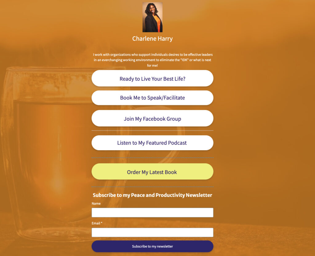
What I like:
- Link to order her latest book and having this CTA in a different color draws a reader’s attention to this important link.
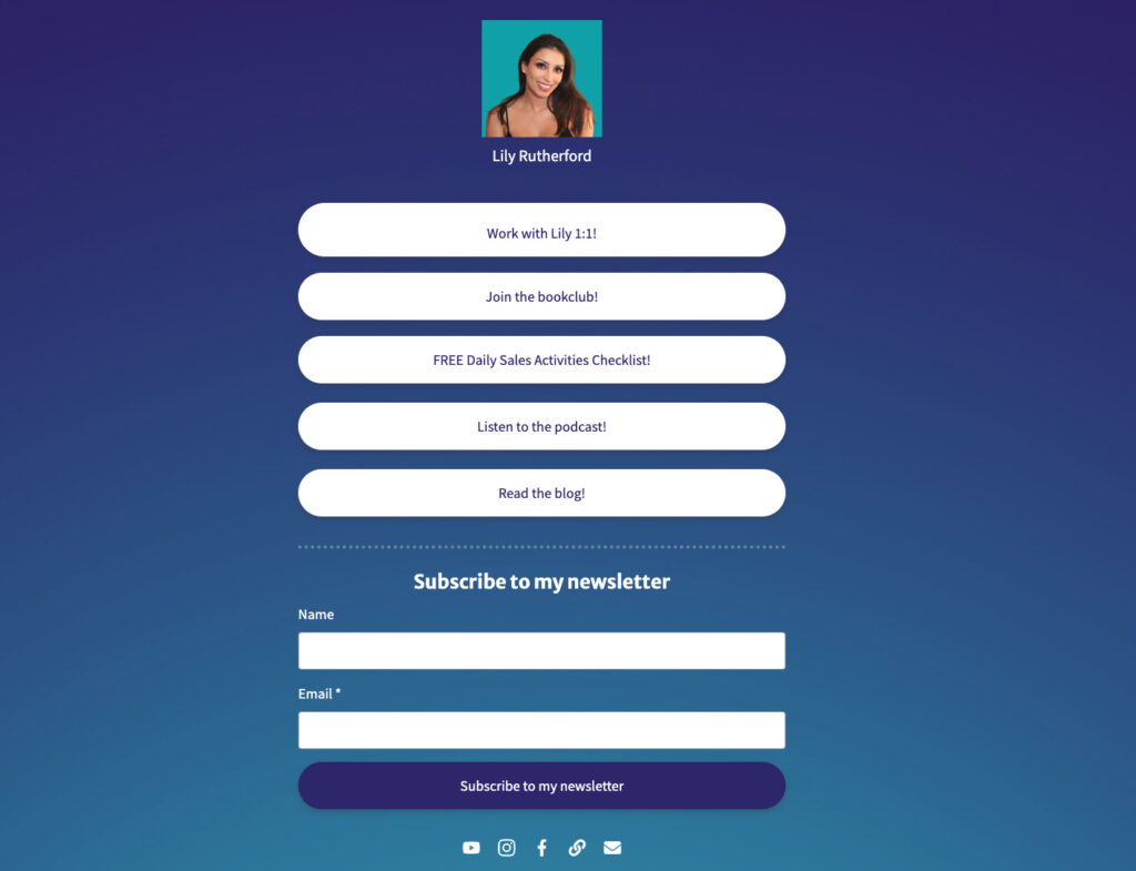
What I like:
- The dark blue background really makes the CTA’s pop.
Pre-launch landing page
A pre-launch landing page is created before the official launch of a product, service, or campaign. It serves as a teaser or preview of what is to come and to generate interest.
The page typically includes a compelling headline, brief description or teaser content, visuals, and a call-to-action encouraging visitors to sign up to receive updates or exclusive access when the product or service becomes available.
When to use:
A pre-launch landing page is used when you want to measure interest level or create excitement about an upcoming launch. It can also be used to collect leads from prospects interested in the new product.
Pre-launch landing page example
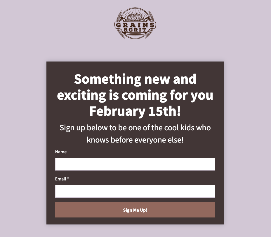
What I like:
- I like how Grains & Grit teases of something coming soon. However this type of landing page will only work with existing customers who are aware of your brand.
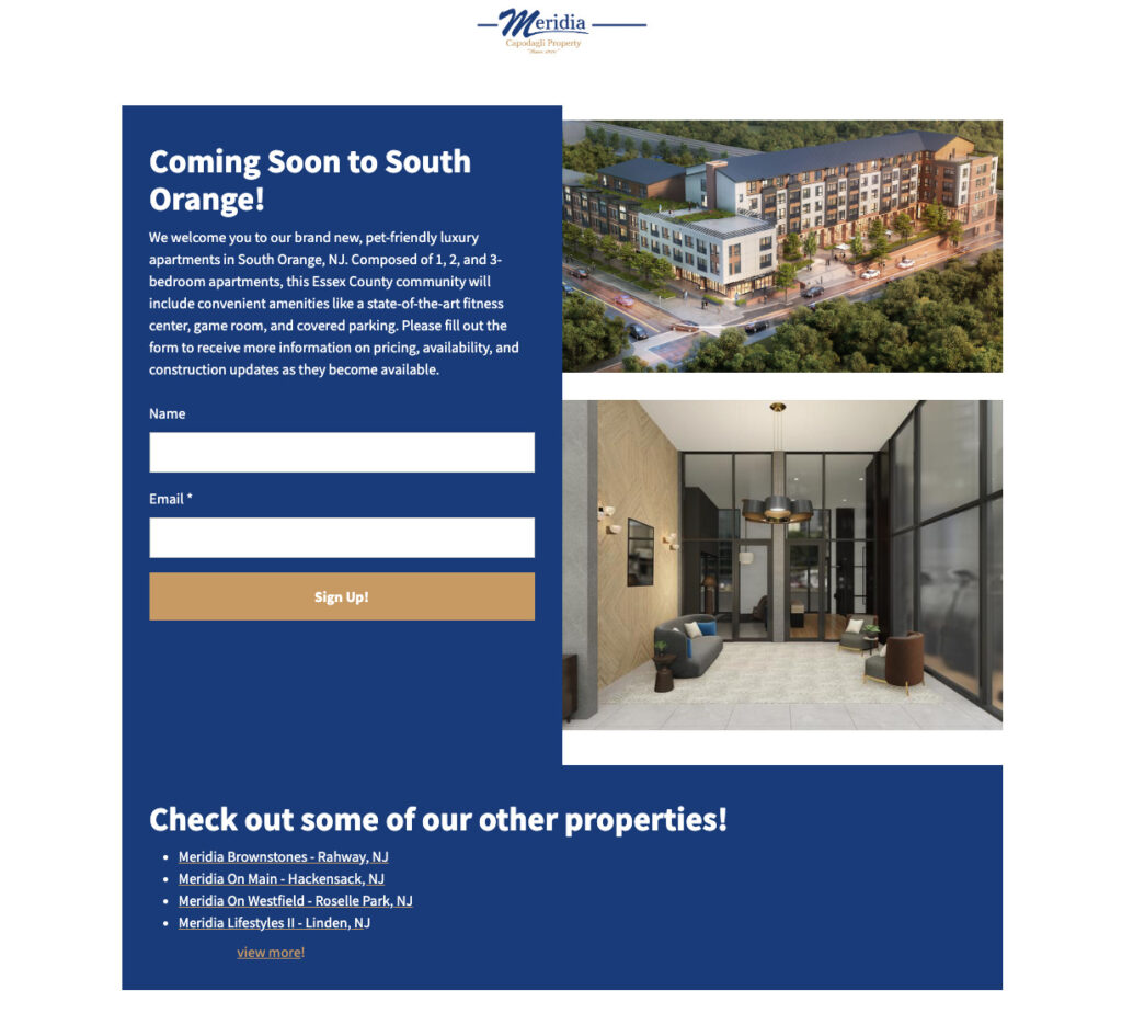
What I like:
- The images and description help people get excited about the property.
- They offer a cross-sell opportunity allowing visitors to check out other properties.
Facebook landing page
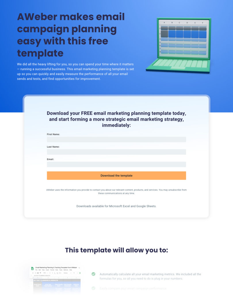
A Facebook landing page is specifically designed to be the initial destination when someone clicks on a call-to-action button or ad within Facebook. It serves as an extension of your Facebook presence, providing additional information, capturing leads, or promoting specific offers or content.
helps you connect and engage with your audience beyond your regular Facebook profile or page.
When to use
A Facebook landing page is used to help you connect and engage with your audience beyond your regular Facebook profile or page.
It should be used when you want to turn your followers into email subscribers. This is important because you never truly own your audience on Facebook. So getting your followers to sign up for your email list opens up a ton of possibilities for when, how, and what you can communicate to them through email.
Driving people to a landing page from Facebook is an effective tactic to grow your email list.
Facebook landing page example
What I like:
- Used an incentive (or lead magnet) to encourage Facebook followers to provide their email.
- Provides examples on how the free template can be used to help support email strategy
Other uses
What’s great about a landing page builder is you can pretty much create a dedicated page for anything you can think of. I’ve seen restaurants who don’t have a website use landing pages for their menu, other corporations use them for social media highlights, for a job posting. The uses are only limited by your imagination.
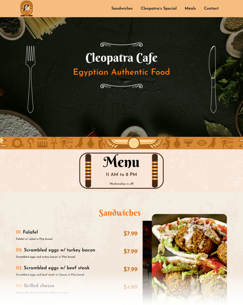
If you’re not sure where to start, log into your AWeber account and begin using one of our customized templates. These drag-and-drop templates let you easily brand and set up your landing pages.
In fact, all but two of the above examples were created using AWeber’s landing page builder.
Don’t have an AWeber account? No problem, you can get started for free today.
The post The 12 most impactful types of landing pages for outstanding results appeared first on AWeber.
from AWeber https://ift.tt/smjeicV
via IFTTT
No comments:
Post a Comment