
One of the most effective emails you can send to your audience is the abandoned cart email. When sent at the right time, an abandoned cart email serves as a helpful reminder to encourage your customers to complete their purchase. Many people put together a cart but get distracted before checking out. In fact, on average, 70.2% of online carts are abandoned.
That is a lot of lost sales.
But you can recover many of these sales with an automated abandoned cart email campaign designed to increase conversion rates.
What is an abandoned cart email?
An abandoned cart email is a reminder sent to visitors who added items to their shopping cart but didn’t complete the purchase. This automated email prompts the visitor to finish their transaction. The best reminder emails are creative and timely, aiming to encourage the completion of the sale.
Supportive calls to actions (CTAs) included in this email can guide the potential buyers to spend more on upgrades or related products or services. Some abandoned cart emails include special deals or free shipping, but most simply serve as a timely reminder to spark action.
Why abandoned cart emails matter
Shopify found that retargeting a customer with an abandoned cart email increases sales by more than 20% and reduces abandoned cart rates by 6.5%. When customers receive a reminder about their left-behind shopping cart, many return to complete their purchase. The best part? You can automate these reminders!
Why do people abandon online shopping carts?
Understanding why shoppers abandon their carts is crucial for creating a more effective sales funnel. According to Statista, the most common reasons for cart abandonment in the US for 2024 included:
- Unexpected costs (shipping costs, taxes, or other charges)
- Account setup required
- Didn’t trust the site with credit card information
- Delivery time was too slow
- Complicated checkout process
- Inability to see the total cost upfront
To improve conversion rates, it’s important to be clear about costs throughout the process and reduce the number of steps required to complete a purchase.
How do you determine your cart abandonment rate?
To determine if your rates improve after implementing an abandoned cart email campaign, you’ll need to calculate your cart abandonment rate. This calculation will serve as your baseline.
The cart abandonment rate is calculated by dividing the number of purchases by the number of shopping carts created during a determined amount of time. Then, subtract this value from 1 and multiply by 100 to determine your cart abandonment rate.
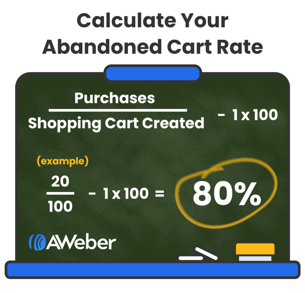
This is the percentage of interest that didn’t end in a sale. Regardless of your current rate, send out reminders to reduce it as much as possible.
What happens after cart abandonment?
Since there are many different reasons a shopper may leave the website without completing the purchase, there are also several things likely to happen after the abandonment. According to Statista, UK shoppers who abandoned their carts were most likely to:
- Purchase the item from the site at a later date (31%)
- Purchase the item from an online competitor (26%)
- Changed their mind or weren’t looking to buy (23%)
- Went to a physical store to make their purchase (8%)
Abandoned cart emails can potentially prompt a purchase from 80% of those shoppers who are still interested in buying.
15 Abandoned cart email best practices
Writing a powerful reminder email means following best practices for abandoned cart emails. Here are crucial steps you should follow to get the most out of your reminder emails:
1 – Use attention-grabbing abandoned cart email subject lines
Getting your email opened is a huge step with a cart abandonment email since many shoppers are used to seeing them. The best email subject lines stand out from the rest of the inbox but still make it clear what the email is about. Good abandoned cart subject line examples include ”You forgot something” or “Oops, Did Something Go Wrong?”
2 – Trigger the email within 24 hours
Statistics show that sooner is more effective than later when it comes to reminder emails. Conversion rates for neglected carts are highest when the email is sent out 30-60 minutes after inactivity. However, those rates plummeted after 24 hours when the lead had grown cold.
3 – Copy should be short & direct
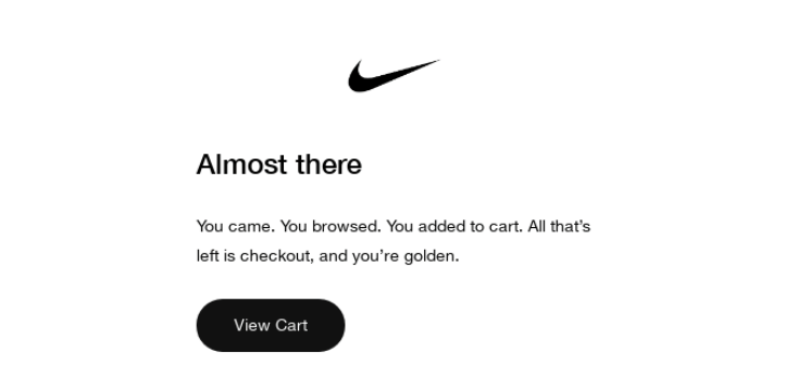
Remind people what they left behind with copy that inspires them to take action. Get to the point quickly with creative and succinct copy by trimming out all the excess. Simply highlighting a key benefit or two could help them finalize their purchase.
Speaking of being direct, check out this example from Nike:
4 – Use images to highlight what they are missing
The brain processes images about 60,000 times faster than text. Images will spark instant reminders of what drew them to your items in the first place. Always include pictures or GIFs of the items they’ve left behind to help provoke a response.
Here’s a great example from Hydrow:

5 – Reinforce the product or service benefits
Retargeting with a reminder email is the perfect time to highlight the product they are considering. Offer your most influential reasons for why they should finish the checkout process on the items in their cart.
6 – Consider a discount or value
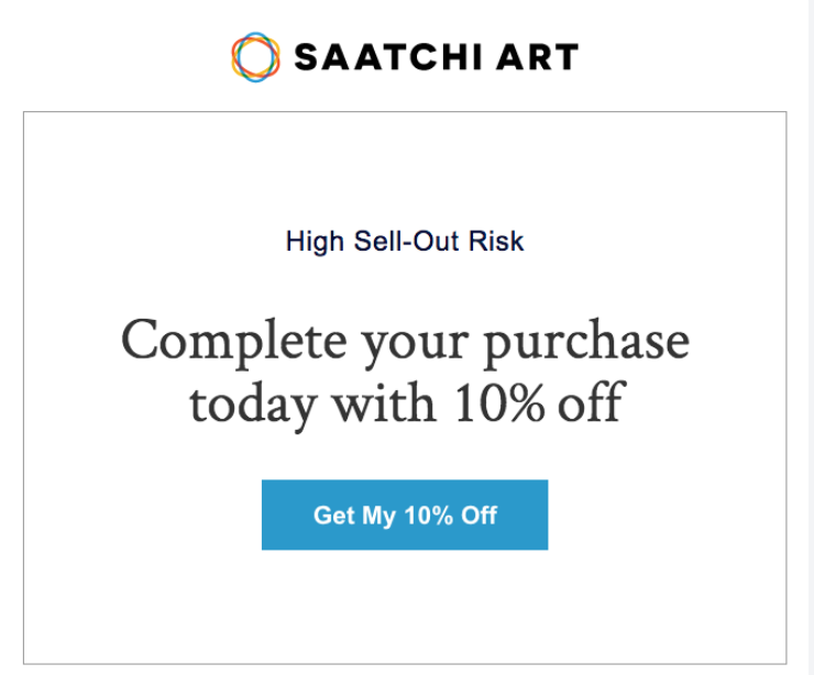
If you plan to offer a great deal, the cart abandonment email is a good time to offer it. Even a small discount, like $5 or 10%, can make it more appealing to finish the purchase. People love to find deals, which could be the perfect way to help them decide to buy.
Saatchi Art does just that, plus they add a FOMO (fear of missing out) headline:
7 – Offer social proof with reviews
Providing reviews or testimonials can help motivate your leads to take the leap and make a purchase decision. Word-of-mouth marketing is highly influential, and a genuine customer review has a similar appeal.
8 – Include a call to action (CTA) that fits your goals
The primary goal of an abandoned cart email is to prompt a return and complete the sale. Your CTA should be positioned to drive that action. Use FOMO to encourage urgency, such as “Get it before it’s gone” or “Limited availability.”
9 – Set up an automated feature
You shouldn’t have to manually send out your reminder emails. Set automated emails for cart abandonment to go out after a certain lapse of inactivity.
10 – Segment your audience
Tailor your abandoned cart emails to different audiences by segmenting them into groups based on things like purchase history, browsing behavior, and demographics. Personalization makes your abandoned cart emails more relevant and, therefore, more effective.
11 – Include dynamic content
Dynamic content in your emails displaying real-time product availability, offers and discounts, or product recommendations keeps your emails feeling fresh.
12 – Highlight limited-time offers:
Draw attention to limited-time offers to create a sense of urgency and to nudge recipients toward a purchase. One way to do this is with a countdown timer. These motivational additions to your email are a great way to get your shoppers to act quickly.
13 – Provide clear contact information
When you simply include your customer service phone number, email, and chat, it gives confidence to your potential customers that you are readily available to answer their problems or questions.
14 – Incorporate additional triggers
Use other behavioral triggers alongside your abandoned cart emails to help keep your brand top of mind. Set up triggers when customers revisit your site or add more items to that old cart.
15 – Test different send times
We already mentioned that it's important to send abandoned cart emails within 24 hours. But when exactly should you send your abandoned cart email? Every business is different, and that's why we encourage you to test different send times to find out what works best for your audience.
Abandoned cart email examples
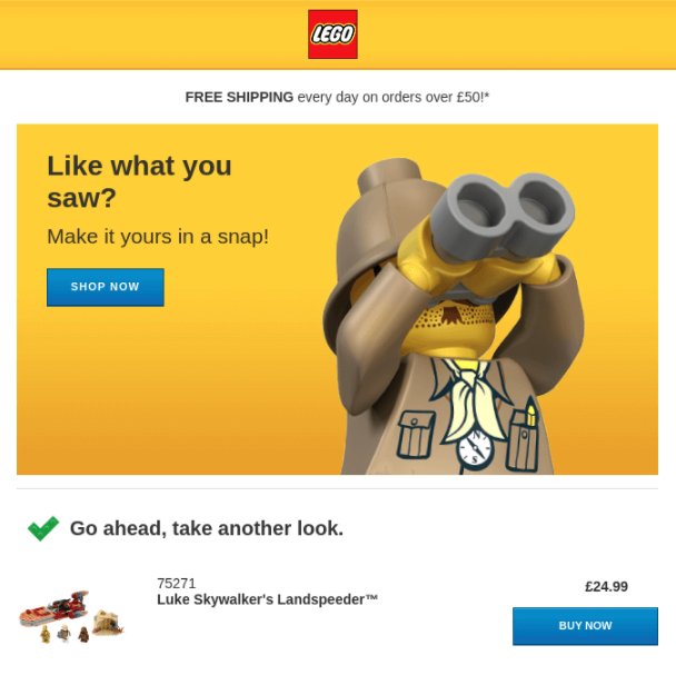
There are all kinds of abandoned cart emails you can consider when creating your own. Here are some of our favorite examples from real brands, showcasing variations of value promise, humor, imagery, and more.
1 - LEGO
What I love about this example:
- Fun and engaging graphics
- Easy purchase process with “Make it yours in a snap”
- Strong positioning of CTAs
- Enticing, supportive, and amusing for someone previously browsing LEGO sets
2 - NOMAD
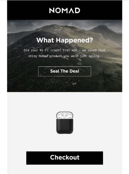
What I love about this example:
- Adds a touch of humor with “What Happened? Did your Wi-Fi Crash?”)
- Light-hearted but effective
- Relevant CTA – “Seal the Deal.”
- Clever reinforcement of their 30-day return policy
3 - Dote
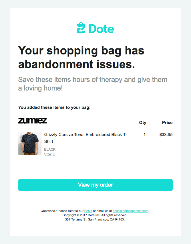
What I love about this example:
- Another joke reminder — “Your shopping bag has abandonment issues.”
- The light-hearted theme continues with “Save these items hours of therapy and give them a loving home.”
- Clean, simplistic, clutter-free design
4 - Dollar Shave Club
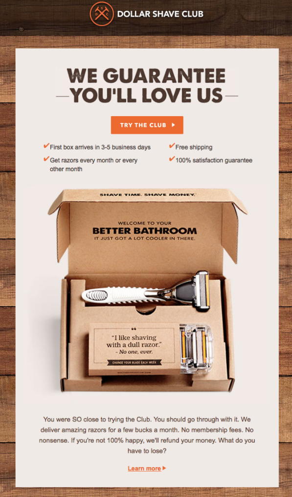
What I love about this example:
- Reinforces brand positioning
- Offers a bold promise
- Highlights several benefits for signing up at the beginning of the email
- Large product shot with a natural flow leading the reader to the CTA for more information.
5 - Pepper
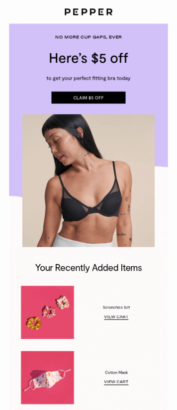
What I love about this example:
- Offers a small discount to spark a purchase
- Features the customer’s most recent cart additions to appeal to potential buyers
6 - Peel
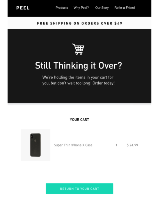
What I love about this example:
- Simple and straightforward design
- Creates a sense of urgency with “We’re holding the items in your cart for you, but don’t wait too long!”
- Clear call to action in a standout color
7 - Gilt
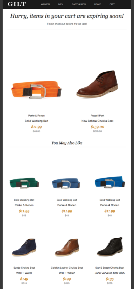
What I love about this example:
- Uses the expiring cart threat to spark immediate action
- Shows alternative colors of the items in their cart to motivate a purchase
8 - Google Express
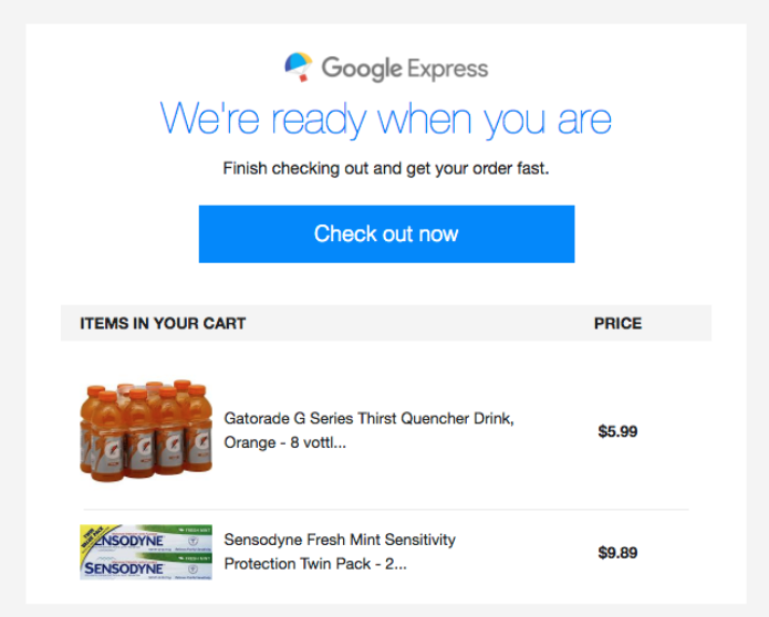
What I love about this example:
- Simple and direct design
- Clearly lists items and pricing from the abandoned cart
- Positions the CTA right below the headline for prime visibility
9 - Doggyloot
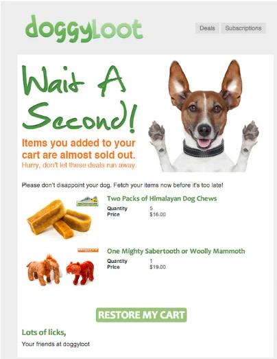
What I love about this example:
- Creates urgency with “Items you added to your cart are almost sold out”
- Clear and prominent “RESTORE MY CART” CTA
- Friendly and warm sign-off
10 - J. Crew
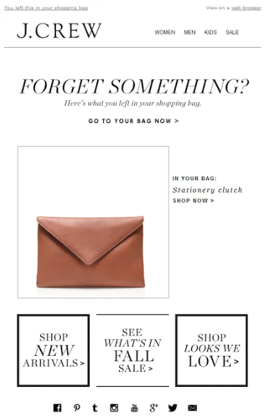
What I love about this example:
- Direct and engaging headline
- High-quality image of the abandoned product
- Clear CTA with “GO TO YOUR BAG NOW”
- Additional CTAs
11 - Whiskey Me
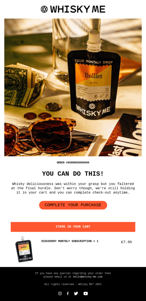
What I love about this example:
- Personalized touch with the order number
- Simple layout focused on action
- Friendly reminder of the item's details
12 - Huckberry
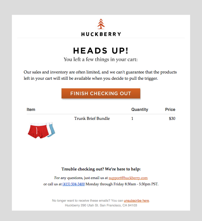
What I love about this example:
- Displays the abandoned item with details.
- Provides easy access to assistance from customer support.
- Creates urgency by mentioning limited sales and inventory.
13 - 23andMe
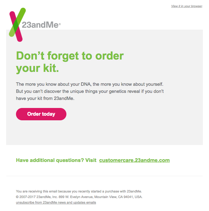
Image from Really Good Emails
What I love about this example:
- Emphasizes the value of the product with a personal benefit statement.
- Clean and simple design, focusing on the message.
- Clear and direct headline: “Don’t forget to order your kit.”
14 - Le Puzz
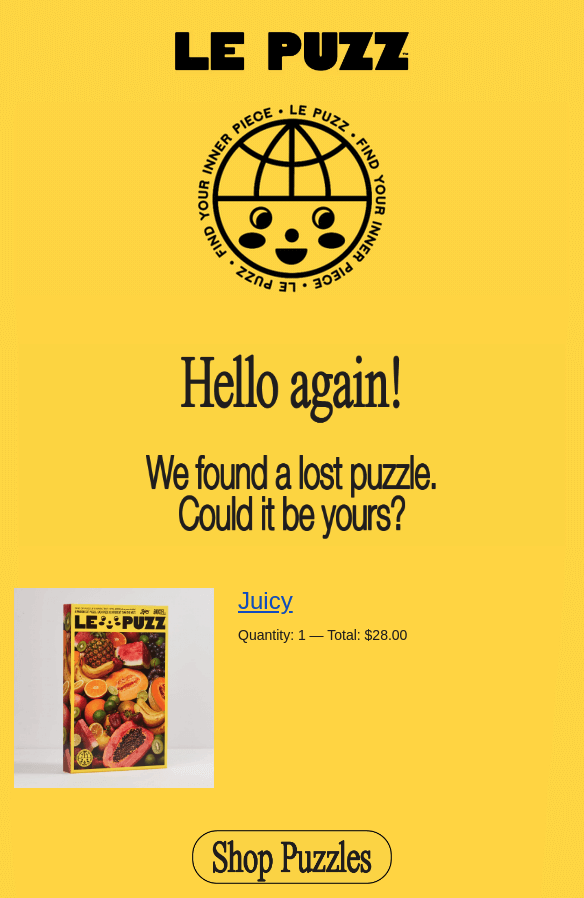
What I love about this example:
- Friendly and welcoming headline: “Hello again!”
- Bright and eye-catching design that stands out.
- Creative and engaging copy: “We found a lost puzzle. Could it be yours?”
15 - Stetson
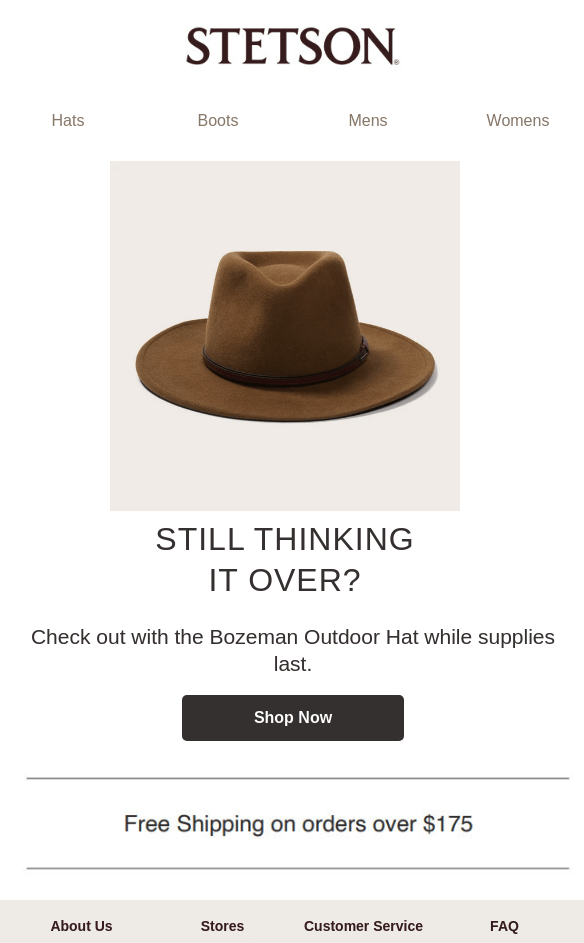
What I love about this example:
- Clean and elegant design.
- High-quality product image to remind customers of the item.
- Free shipping offer prominently displayed to add extra incentive.
Win back more lost sales with the perfect cart abandonment email
Don’t miss out on the opportunity to target a warm lead and recover lost sales. Set up your abandoned cart email in AWeber for an easy solution with powerful results. If you need help getting started, we have a pre-built campaign.
The post 15 Abandoned cart email best practices to make more sale appeared first on AWeber.
from AWeber https://ift.tt/C2xtGEo
via IFTTT
No comments:
Post a Comment