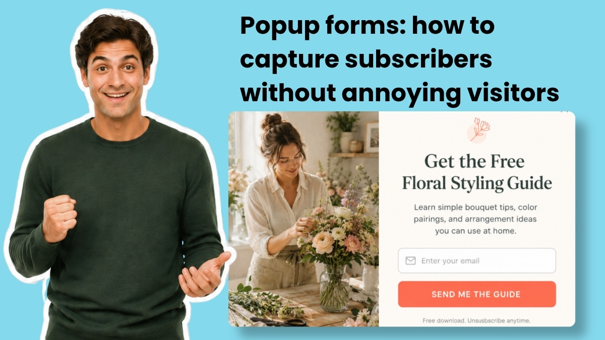
A popup form is a small overlay window that appears on your website to collect email addresses. Done right, it's the fastest way to grow your list. Done wrong, it's the fastest way to lose a visitor.
The difference has nothing to do with the popup itself. It's about when, where, and how often it appears.
Most popup forms fail because they show up too early, too often, and on every page. The visitor hasn't even read a sentence yet, and you're asking for their email. That's not a conversion strategy. That's an interruption.
You can build a popup that converts and still respects the person on the other side of the screen. Here's how.
How to design a website popup
The fastest way to design a popup is to describe what you want. The AI Signup Form Builder from AWeber creates the entire popup from a text description. Tell it your business, what you're offering, and when the form should appear. Something like: "I run a marketing blog. Offer a free email checklist. Show the form after 30 seconds." The builder generates the copy, design, layout, and fields. You can edit any element or use it as-is.
Once the form is ready, it connects to your AWeber email list automatically. When someone submits the form, they're added to the list you selected and can enter any automation sequence you've built. No coding, no separate design tools, no third-party plugins. (For step-by-step instructions, see AWeber's guide to creating a form with the AI builder.)
Whether you use the AI builder or design manually, the same principles apply.
Start with a specific headline
Your headline should state what the visitor gets in under ten words. Not "Subscribe to our newsletter." Instead, "Get the weekly marketing checklist." The visitor should understand the offer before they read anything else.
"Free email marketing checklist" beats "Join our list" every time. Name the deliverable. Be specific about what shows up in their inbox.
Add a value statement (optional)
One sentence of context below the headline. "Sent to your inbox in 60 seconds" or "Used by 5,000+ small business owners." This line builds urgency or credibility. If the headline is clear enough on its own, skip it.
Keep the form to one or two fields
Email is the only field you need to start a relationship. If you want a name for personalization, add one more field. That's the ceiling for a popup.
Every additional field reduces completion rates. Collect everything else later through a welcome email, segmentation, or a preference center. (For inline forms on dedicated pages, you have more room. See our guide on lead capture forms that convert.)
Use action language on the button
"Send me the checklist" outperforms "Submit." First person ("Get my free guide") outperforms second person ("Get your free guide") in most tests. The CTA button is doing the final work. Make it specific to the offer.
Make the close button obvious
Not a tiny X in the corner. Not a guilt-tripping "No, I don't want more customers" dismiss link. A clear, visible close option. If someone doesn't want to subscribe right now, let them leave easily. Trapping visitors doesn't build trust.
When should a popup form appear?
Timing decides whether the popup feels helpful or hostile. A popup that fires in the first three seconds tells the visitor you care more about their email than their experience. A popup that waits until someone has scrolled halfway down the page, or spent 30 seconds reading, appears when the visitor is already engaged.
The three most effective triggers are scroll depth, time on page, and exit intent.
Scroll-based triggers
Scroll-based triggers show the popup after the visitor scrolls a percentage of the page. For blog posts, 40% to 60% scroll depth works well. The visitor has consumed enough content to have an opinion about your site.
Time-based triggers
Time-based triggers fire after a set number of seconds. Fifteen to thirty seconds gives most visitors enough time to engage. Anything under ten seconds feels aggressive.
Exit-intent triggers
Exit-intent triggers detect when a visitor's cursor moves toward the browser's close button or address bar. The popup appears just before they leave. This is the least intrusive option because you're only reaching people who were about to go anyway. Exit-intent popups consistently convert at higher rates than timed popups because they don't interrupt the reading experience.
You can combine these triggers. Show a scroll-based popup to engaged readers. Reserve exit-intent for everyone else. Readers deep into your content get the offer when they're most interested. Visitors who are leaving get one more reason to stay connected.
How often should the popup appear?
Once a visitor closes your popup, showing it again on the next pageview is the fastest way to train them to leave.
Set a frequency cap so the popup appears once per session, or once every seven days if you want to be more conservative. Repeated popups don't convert resistant visitors. They just confirm the decision to leave. If someone closes your popup, respect that decision for at least the rest of their visit.
Where should a popup form appear?
Not every page on your site needs a popup. Showing the same form everywhere dilutes its impact and frustrates visitors who see it repeatedly across different contexts.
Page targeting
Match the popup to the content. A popup offering a "blog writing checklist" makes sense on a post about content marketing. It makes no sense on your pricing page. Show popups only on pages where the offer is relevant.
A generic "join our newsletter" popup works nowhere as well as a targeted offer tied to the content. If someone is reading about email automation, offer a resource about email automation.
Device targeting
Popups behave differently on mobile and desktop. A popup that looks fine on a laptop can cover the entire screen on a phone.
Google has used intrusive mobile interstitials as a negative ranking signal since January 2017. Full-screen popups that cover all content immediately on mobile page load can hurt your search rankings. Popups triggered by a time delay, scroll depth, or exit intent are not penalized.
Show a smaller banner or slide-in on mobile. Save the full-screen popup for desktop. Make the close button easy to find and tap on any screen size.
Popup form examples
Four examples of forms created using the AI Signup Form Builder in AWeber.
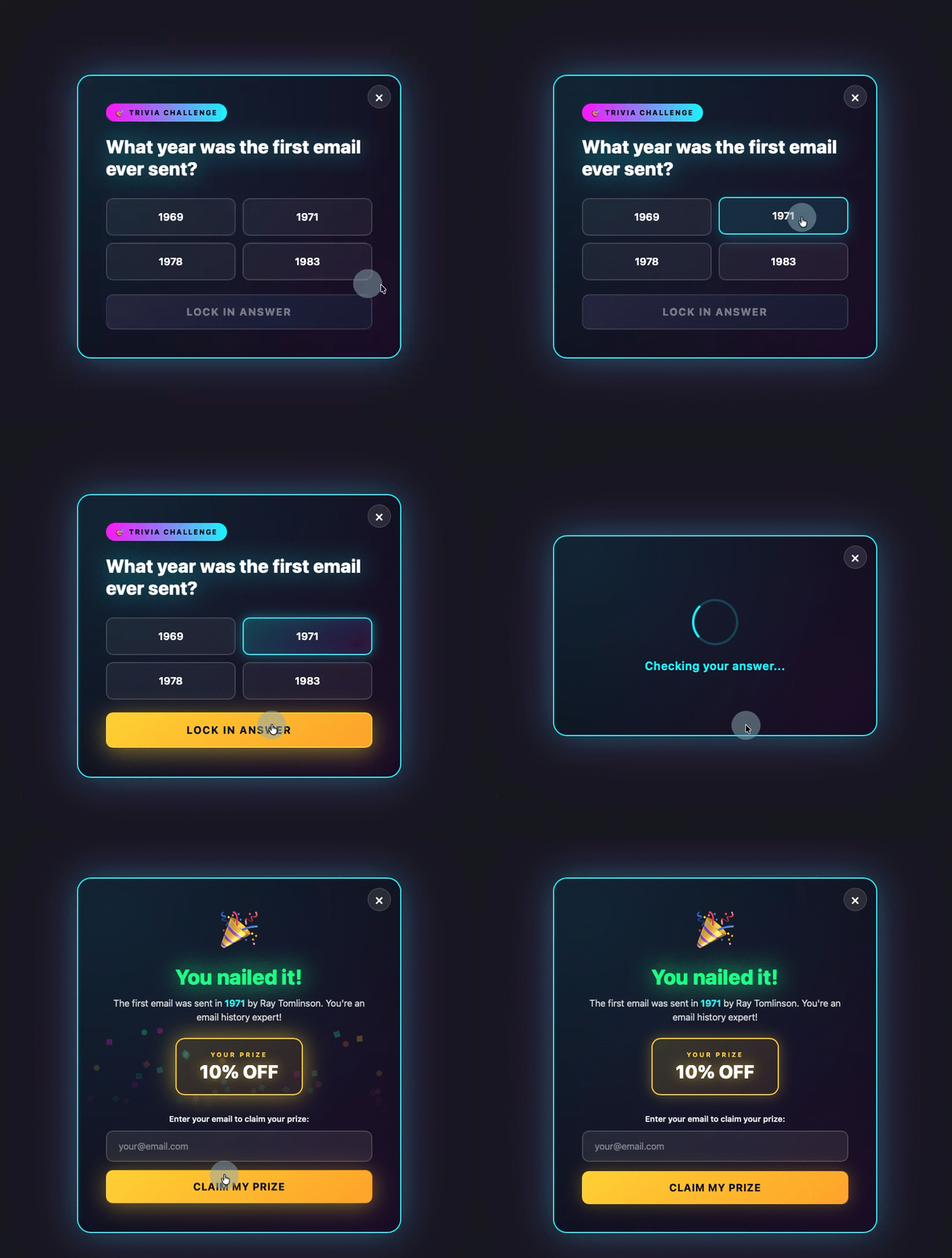
Gamify
Turn the popup into a quiz, trivia question, or spin-to-win wheel. The visitor engages before they see the email field.
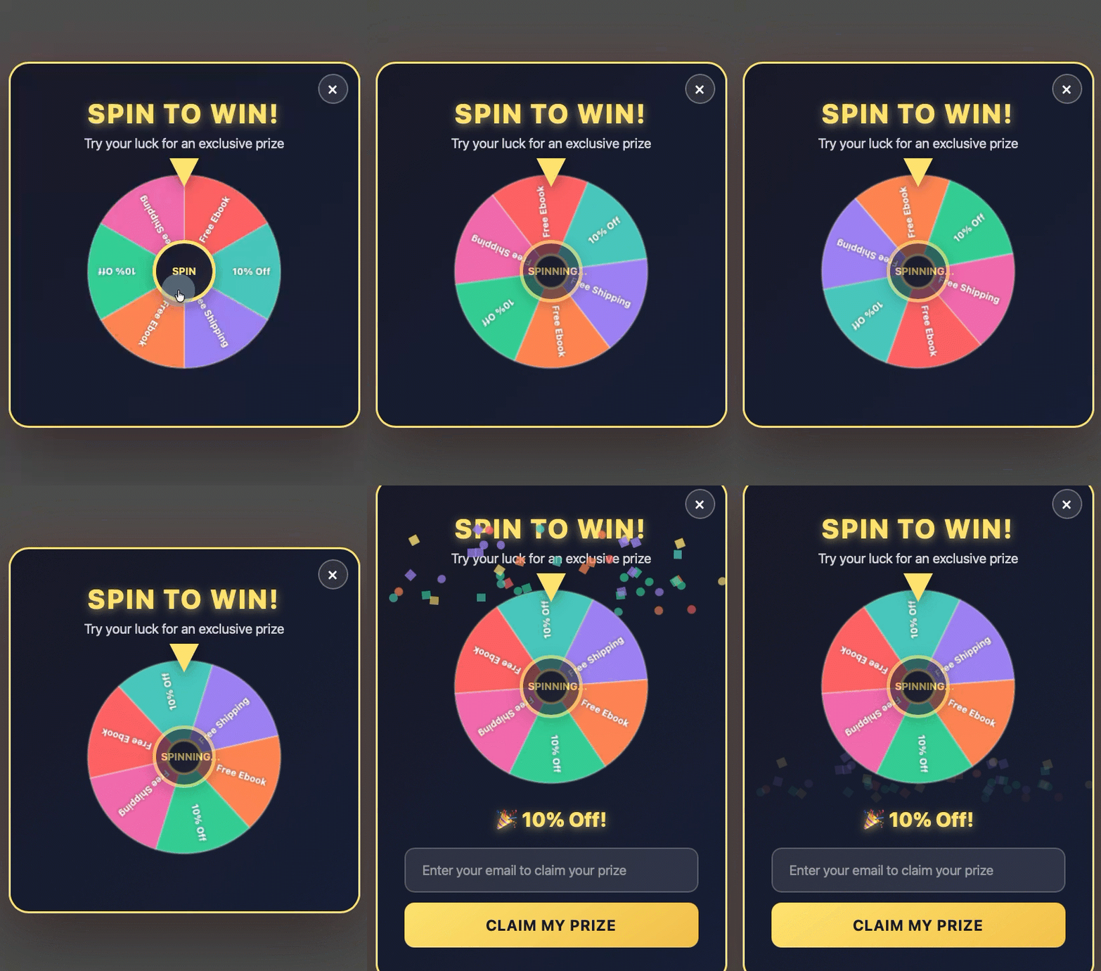
Discount offer
A spin-to-win wheel or coupon popup that fires right before someone leaves. The visitor enters their email to claim the prize.
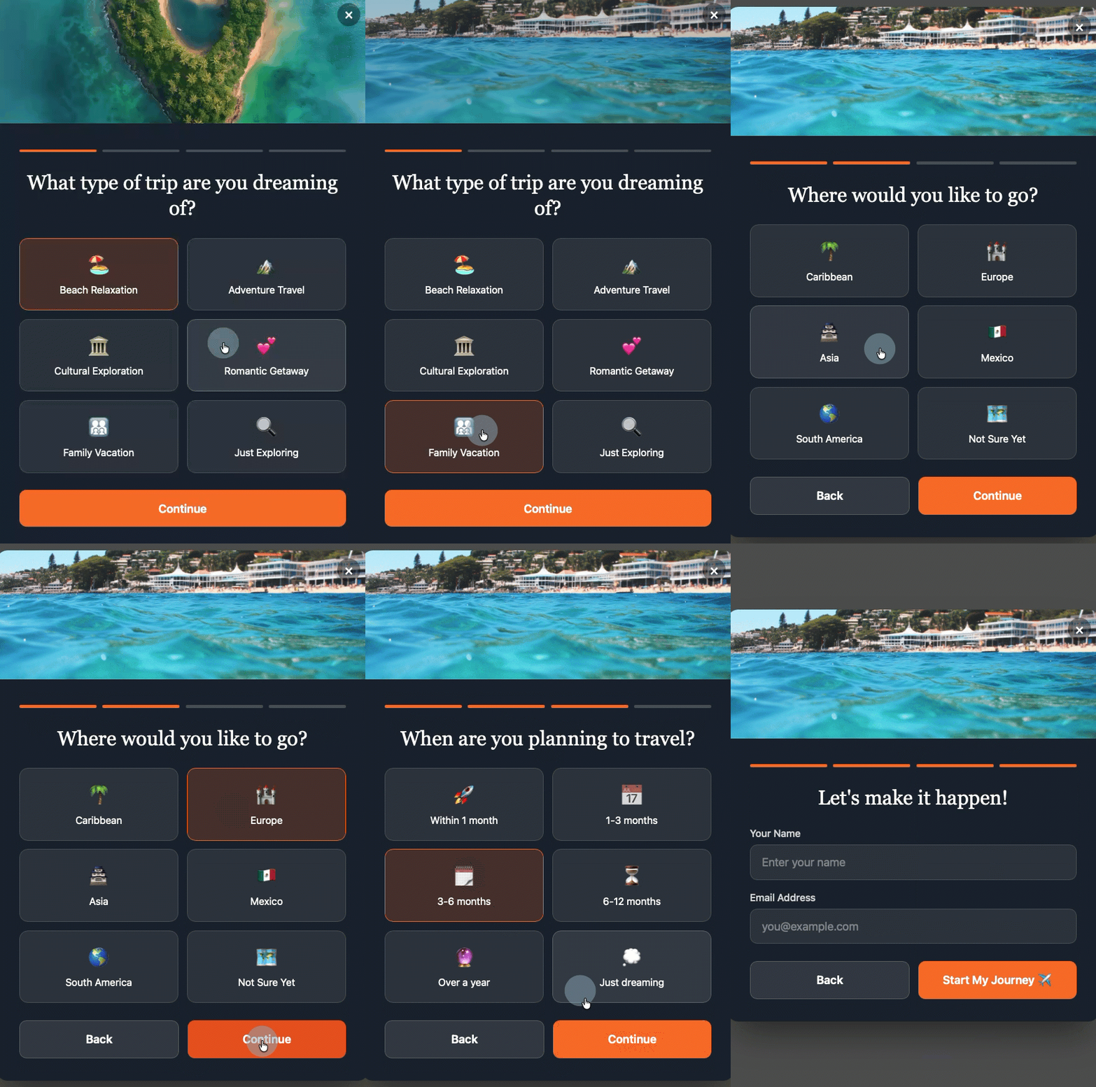
Multi-step form
The visitor makes a low-commitment decision first. By the time they see the email field, they've already said yes.
Sticky bar
A thin bar at the top or bottom of the page with a form field and CTA button. Always visible, never blocking content.
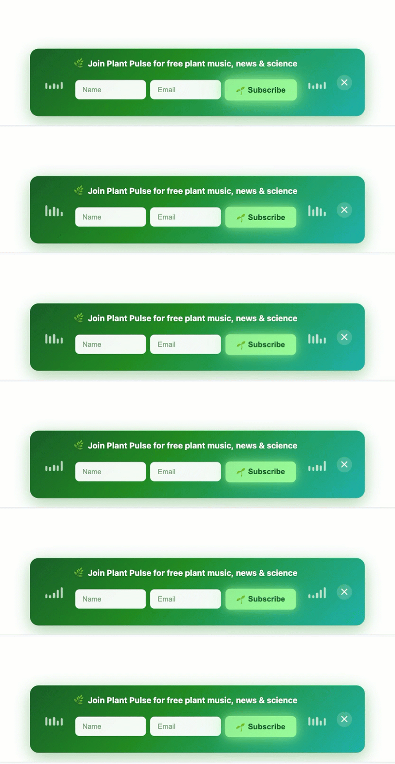
You can build any of these formats with the AI Signup Form Builder. Describe the format you want, set the timing, and the builder handles the rest.
The post Popup forms: how to capture subscribers without annoying visitors appeared first on AWeber.
from AWeber https://ift.tt/YCIlbRS
via IFTTT

No comments:
Post a Comment