We've all messed up with email marketing at some point. You hit send, and then that sinking feeling hits you. You've goofed up, and now it's out there for everyone to see. It's like sending a message in a bottle into the vast sea of the internet, and you can't reel it back in.
Some email marketing mistakes are obvious and can undo all the hard work you've poured into your campaign. But there are other blunders that are equally damaging, yet you might not have even realized you were making them. You might be oblivious to some of the mistakes you've made until it's too late.
And when those mistakes get sent out to thousands of people in an instant, the fallout can be huge.
Knowing what email marketing mistakes to watch out for, can help you avoid them altogether.
So here’s our list of the most common email marketing boo-boos:
Your subject lines are boring
Look at the subject line below. What does it tell us about what lies within the email?

Absolutely nothing. It’s not creative or relevant to the content inside, so there’s nothing about it that would make someone feel compelled to open it. And see that email preheader after the subject line? (“If you’re having trouble…”) That space could’ve been used to tease the email too.
You have about 35 characters to work with in your subject line, so make them count! Your subject line needs to grab attention and tell the reader something about the email itself, because that is what will sell them on opening your email.
You’re not using personalization
What’s the best way to get someone’s attention? You address them by their name! It works the same way with email. If you’re not using personalization on your most important messages, you’re missing a real opportunity.
Just like adjusting your From address to your real name, using personalization in your emails is another way to make your business more human.
You’re sending to the wrong people
Sending an email to the wrong audience is a big email marketing mistake.
If you own a burger joint in Philadelphia, you wouldn’t send newsletters to vegetarians in San Francisco, right? This is why segmenting and list management is key, especially for those with growing email lists.
Tell your audience exactly what they’re signing up for on your sign up form and stick to it.
You can also use your form to segment people based on location, interests, or any other preference. If you only want to send emails to those who opened a particular message, you can segment based on open rates too.
Once you’ve hit your sweet spot of segmentation, ask your readers for feedback so you can continue sending them content they want.
Emails not optimized for mobile
These days, most people are using their phones to check their emails. That's why it's crucial to ensure your emails look good on mobile screens.
If your emails are hard to read, then your subscribers are less likely to read them. Mobile-friendly emails help readers scan, identify key points, and make quick decisions.
It's surprising how many companies still don’t avoid this common email marketing mistake.
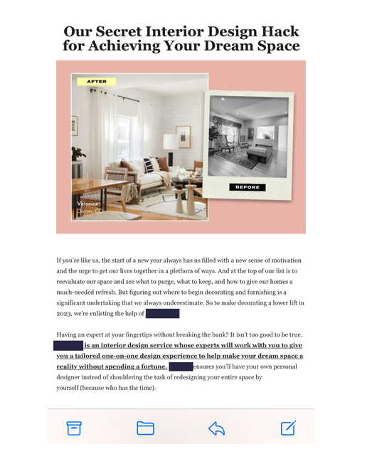
Here’s an example of an email that is difficult to read on a mobile device. If you have to zoom in on the content or image, then the email is not optimized.

Buying email lists
Avoid this email marketing mistake at all costs.
Effective email marketing campaigns cater to specific demographics, tastes and interests. Using confirmed opt-in to obtain the proper permission from people who are truly interested in your targeted emails ensures that they really want to hear from you.
When you buy an email list, there’s no way to guarantee that those people are really interested in your messages, so you must avoid purchased lists at all costs. You can never assume anything about the addresses of random people that are not given to you directly by their owners.
Hard to recognize “from” names
Once subscribers are on your list, you want to make sure that they open your messages regularly. Your subject line and from name/address are your only chance to grab subscribers attention in their jam-packed inboxes.
To help jog their memory, always use the same email address and contact name so that there is no confusion when your messages arrive. Your subject lines must clearly present the value of the emails while staying consistent with your past subject lines to evoke recognition and familiarity.
Avoiding CAN-SPAM compliance
The Can-Spam Act requires that all messages contain the sender’s valid physical postal address, but some home-based and international businesses are hesitant to include this information in their campaigns.
Related: How to Include a Physical Address in Your Emails Without Revealing Where You Live
Aside from the legal obligation, putting your contact address in your emails is the best way to show subscribers that you have a legitimate identity and that you won’t run for the hills as soon as they make a purchase from you.
See how Grammarly includes their physical address at the bottom of every email.

Irrelevant and infrequent emails
Sending emails that don’t relate back to their original request for info irritates readers and is a guaranteed way to rack up a high number of unsubscribes. Add an infrequent schedule to the previous scenario and you have a recipe for email disaster.
As a rule of thumb, if you haven’t contacted subscribers in 6 months, delete them from your list. Revisit your landing page from time to time to assess your email content and make sure it matches up with your original offer. Set expectations so that subscribers know what to expect from you, and when to expect it.
No call to action
With all of the emphasis placed on quality content and sharp design, it’s understandable that marketers sometimes miss the obvious. When a reader opens a message and they’re interested in learning more, don’t forget they will be thinking, “What do I do next?”
Give them a way to move forward easily. Include multiple calls to action and links back to your site so you don’t lose them. Set up your products favorably, and remember when creating your messages that there must be a logical sequence of events – you want readers to open, read, click-through and ultimately buy.
Your call to action isn’t very… actionable
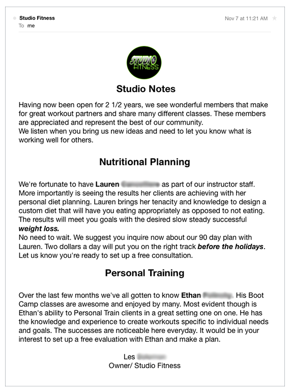
Take a look at this email from Studio Fitness.

There is no link to the nutritionist or personal trainer they introduce us to, and while they encourage us to sign up for a plan, there is no link to help us do that either. Oh, and we can’t access the Studio Fitness website from this email. Since there could be any number of gyms named Studio Fitness, leaving subscribers to find their website on their own is probably not a great idea.
Not testing before sending
Another avoidable email marketing mistake. With all of the time spent prepping marketing emails, typos can easily go unnoticed. Testing your messages before sending them only takes a minute or two and can help you pinpoint problems before they materialize.
Send test copies to test accounts at several different email services to ensure that the message is readable, the images are viewable and the links are functional.
No replies allowed
Nothing says “you’re just a number to us, buddy” than an email campaign that tells you not to bother replying.
One of the advantages of email marketing over other mediums is that it lends itself to having a two-way conversation with your customers and prospects — why would you shut out subscriber interaction and feedback like that?
Including too many images
Images look great in an email, but use them sparingly. There are several reasons why:
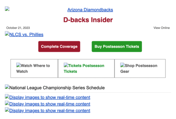
1 - Not all email clients automatically load images so If a recipient has image loading turned off, they might see a blank email or just alt text, missing the entire content.
Here's an example of what that would look like:

2 - Images that look good on a desktop are often not easily readable when they’re scaled down on a phone or tablet.
3 - It increases load time: High-resolution images can be large in size, leading to longer email load times. This can be especially problematic for recipients with slower internet connections or limited data plans.
Adding images that are way too big
Don't include images with HUGE file sizes in your email. This is an accessibility issue because it can make your emails more difficult to read for people on slow connections, and it unnecessarily uses your readers data when they may be on plans with limited data.
A good rule of thumb is to keep your images under 200KB.
Your content is too self-promotional
If you send an email announcing your new software update, who cares? But if you send an email announcing that it’s possible to cut video upload time in half because of your software update, people will pay attention. It’s all about showing the value of your services while promoting your business.
So, how can you do both?
Identify your audience’s biggest problems. Brainstorm content ideas based on real problems your customers are having, then show how your services can fix them.
Let’s say you work with a recruiting agency. Your subscribers need resume help, so why not give them a checklist to help them fix common resume faux pas?
You’re inconsistent
How would you feel if you received a weekly newsletter and then, without warning, weekly emails turned into 10 emails a day? You wouldn’t be very happy, would you? It sounds a little ridiculous, but it happens more often than you think. Readers tune out and unsubscribe when they don’t receive what they signed up for.
So deliver the emails you promised in your sign up form and stick to an editorial calendar if possible.
Your follow up series is nonexistent
Let’s say you have a customer who starts a free trial of your software service, but they never follow through and make a purchase. Sad story, right? It certainly will be if you don’t have a triggered-based follow up series in place.
While you can’t control a customer’s behavior, you can control how you react to it. If you set up a follow up email that will automatically send to that customer at the end of their free trial, you have a better shot at keeping them engaged.
If they had a question about your service, the email could prompt them to contact you, giving you another opportunity to make the sale.
Are you making these email marketing mistakes?
We know email marketing isn’t always easy. Everyone makes mistakes, but some of the most common email marketing mistakes can easily be avoided.
If any of the situations on the list above hit close to home, try changing your approach; you’ll be amazed at the impact a few simple changes can have on your campaign.
Once you put the changes into practice, come back and leave a comment to let us know how they have worked for you!
The post 17 of the most common email marketing mistakes to avoid appeared first on AWeber.
from AWeber https://ift.tt/sgU7uJ3
via IFTTT
No comments:
Post a Comment